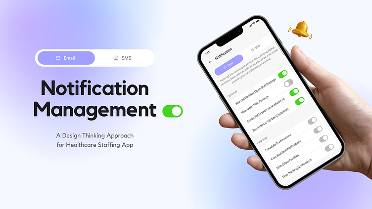
Enhancing User Notification Settings: A Design Thinking Approach
In redesigning the notification settings page for a healthcare staffing app, I focused on addressing key user needs while enhancing overall user experience.
User Pain Points:
1. Lack of customization: Users cannot personalize their notification preferences according to their communication needs.
2. Confusion in notification types: Users may struggle to differentiate between required and optional notifications, leading to potential oversight of important messages.
3. Limited control: Users have limited control over opting in or out of specific communication channels, resulting in an inability to manage their preferences effectively.
4. Overwhelming interface: The existing notification settings interface may be cluttered and overwhelming, making it difficult for users to navigate and adjust their preferences.
5. Inefficient communication: Without clear distinctions between required and optional notifications, users may receive irrelevant messages, leading to information overload and reduced efficiency.
6. Lack of transparency: Users may not understand which notifications are mandatory and which are optional, leading to uncertainty about their ability to manage their communication preferences effectively.
Design Thinking Approach:
Identified user preferences: Through user research and feedback analysis, I recognized the importance of segregating notifications by type (email and SMS) and distinguishing between required and optional communications.
Ideation and Prototyping: Leveraging design thinking principles, I conceptualized a solution that incorporated tabs for email and SMS notifications, each containing separate sections for required and optional communications. This approach provided users with clear visibility and control over their notification settings.
User Testing and Iteration: Conducted usability testing to gather feedback on the proposed design. Iterated based on user input to ensure intuitive navigation and clarity in communication preferences.
Implementation: Implemented the finalized design solution, ensuring seamless integration with existing app functionalities.
Design Solution
1. Tab-based organization: Implement a tabbed interface to segregate notification settings into distinct categories, such as email and SMS.
2. Clear distinction: Clearly differentiate between required and optional notifications within each category to provide users with immediate clarity on communication importance.
3. Opt-in/out controls: Offer intuitive toggles or checkboxes that allow users to opt in or out of specific notification types, providing them with granular control over their communication preferences.
4. Visual hierarchy: Utilize visual cues such as color, icons, or text styles to highlight mandatory notifications and distinguish them from optional ones, aiding users in prioritizing their settings adjustments.
5. User-friendly customization: Enable users to customize their notification preferences easily, allowing them to tailor their communication channels based on their unique needs and preferences.
6. Feedback and confirmation: Provide feedback mechanisms or confirmation prompts to ensure users understand the impact of their notification settings changes and confirm their selections before finalizing them.
Result:
The redesigned notification settings page offers users a user-centric approach to managing their communication preferences. By utilizing tabs and distinct sections for required and optional notifications, users can easily customize their notification channels according to their preferences. This design enhancement not only improves user satisfaction but also enhances the overall usability of the healthcare staffing app.
Overall, the redesign showcases the effectiveness of applying design thinking principles to address user pain points and deliver an enhanced user experience.


