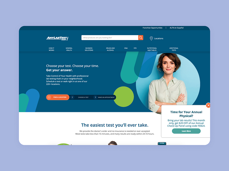
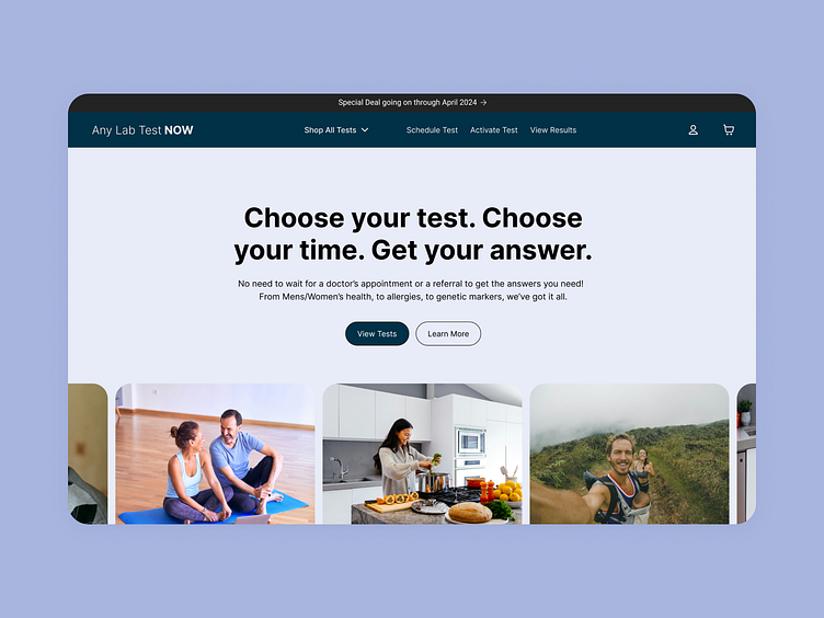
Landing Page Re-design @Anylabtestnow

Before 👉 After Landing Page re-design (Original Below)
- kept the same hero messaging (the original communicated the value prop pretty well) ✅
- Did away with the 1-2-3 element from before. It was a button that acted like a modal 🤨
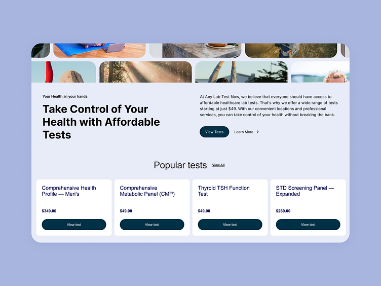
- Changed the flow from location/test/appt to shop-checkout-location, since an e-commerce flow is much more familiar to users 🤑
- Updated the visuals to smiling, happy, and healthy people (the future that customers want) 😇
Overall the value prop + CTA combo on this new version is 100x better. The old one is incredibly confusing and probably is hurting conversions. They get around 200k visits per month, so even a 1% increase would make a huge difference!