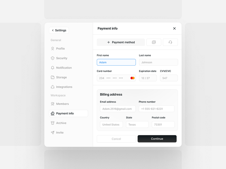
Payment Info
✦
Adding payment information can be difficult, especially within user dashboards, because it often involves asking many questions. This can frustrate users and lead to a poor experience. To address this, I've simplified the process by putting all the necessary input fields and information on just one page instead of spreading it across multiple steps or showing multiple pop-up windows. This makes it easier for users to provide their payment details and improves their overall experience.
If you liked it, please give it a ❤️
More by XOLAB View profile
Like


