404 Error Page for Fintech Platform Bankr💸
Here’s my analysis:
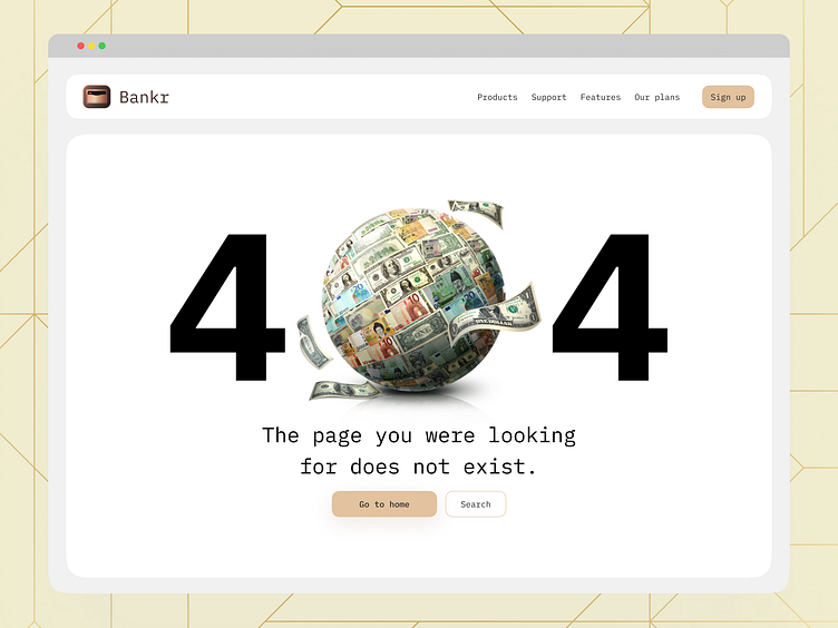
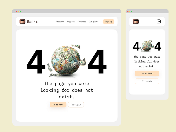
1: Visual Elements:
- The central focus is a globe made of various international currencies, symbolizing the global reach and diversity of financial transactions.
- The 404 text is prominently displayed, effectively conveying the error message.
- The use of gradient colors adds depth and visual interest.
2: Message and Tone:
- The design maintains a professional tone suitable for a fintech platform.
- The concise error message ensures clarity for users encountering a broken link or missing page.
3: User Experience (UX):
- The minimalist layout avoids overwhelming users.
- Clear call-to-action buttons (e.g., “Back to Home” or “Contact Support”) guide users toward helpful next steps.
4: Branding Opportunity:
- Consider incorporating brand elements (logo, color palette) to reinforce brand identity.
- Use micro interactions (subtle animations or hover effects) for a delightful user experience.
Overall, this 404 page balances aesthetics, functionality, and brand consistency effectively. Peace🌐💰
Thank you very much for being here💛
Contact me:
✨All My Websites: https://bento.me/karimsaif
📬Business Inquiry: karimsaif010@gmail.com
🥇Everyday posts: LinkedIn
🏆Big projects: Behance
🧠Products Free to learn: Gumroad
Show us your love ❤️ by pressing "Like" or leaving a comment to let me know your valuable opinion.
Want to see more projects? Visit our profile and remember to follow us!
Thanks for watching! I hope you guys like it!✨