Fitness app screens design for apple watch
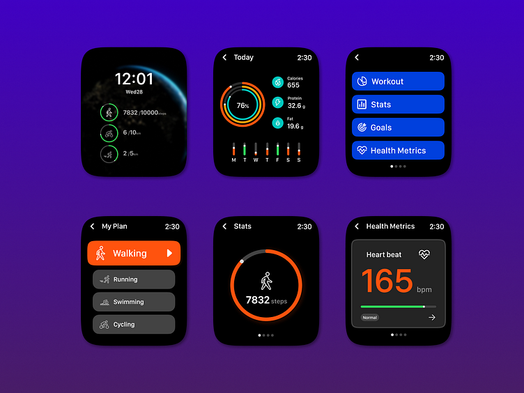
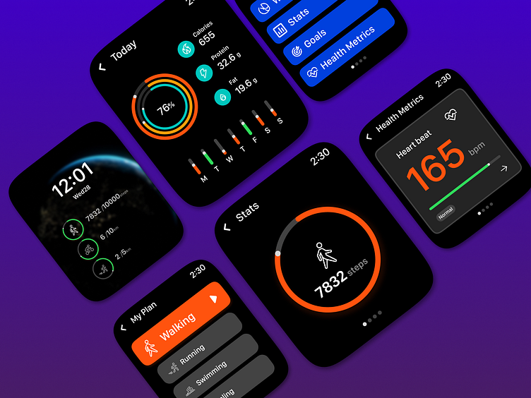
My design prioritizes a clean and uncluttered aesthetic, focusing on displaying essential fitness data in a clear and easy-to-read format. This is ideal for users who want to quickly glance at their watch and get a snapshot of their progress without being overwhelmed by information.
I’ve included multiple screens, each showcasing different fitness metrics. This allows users to see a variety of data points without feeling overloaded on a single screen. Swiping through the screens provides users with a more comprehensive picture of their workout.
I use gauges and circles to represent progress towards goals (steps, calories burned) and heart rate. This visual approach is easy to understand and allows users to track their advancement at a glance.
The use of color coding (green, blue, red) likely corresponds to Apple’s Activity rings (green for Exercise, blue for Stand, red for Move). This leverages a familiar system for Apple Watch users making it intuitive to understand.
The screens display metrics commonly tracked during workouts including elapsed time, calories burned, heart rate, and steps. This selection provides users with the most relevant information to gauge their performance.