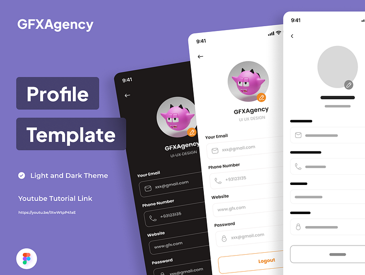
Profile page ui
Crafting a visually appealing profile screen UI design in Figma requires attention to detail and an understanding of both aesthetic principles and user experience. Here's a step-by-step guide to help you create an engaging profile screen:
Research and Planning: Before diving into design, understand the purpose of the profile screen and its target audience. Gather inspiration from existing designs and analyze what works well.
Wireframing: Begin by sketching out the basic layout and functionality of the profile screen. Identify key elements such as profile picture, username, bio, and any other relevant information.
Layout Design: In Figma, create a new file and set up artboards for different screen sizes if designing for multiple devices. Start by placing essential elements like the profile picture, username, and bio in a visually balanced manner.
Typography and Color Scheme: Choose fonts that reflect the app's brand identity and ensure readability. Define a cohesive color palette that complements the overall design and conveys the desired mood or tone.
Visual Elements: Add visual interest by incorporating icons, illustrations, or decorative elements that enhance the profile screen's aesthetics while maintaining clarity and simplicity.
Focus on User Interaction: Consider how users will interact with the profile screen. Incorporate intuitive navigation elements such as buttons or gestures for editing profile information, logging out, or accessing additional features.
Feedback and Iteration: Solicit feedback from peers or stakeholders and iterate on your design based on their input. Test the usability of the profile screen prototype to identify any areas for improvement.
Final Touches: Fine-tune the design by adjusting spacing, alignment, and visual hierarchy to ensure a polished and professional appearance. Pay attention to details such as drop shadows, gradients, or subtle animations to add depth and dimension.
Prototyping and Presentation: Use Figma's prototyping features to create interactive prototypes that simulate user interactions. Present your design to stakeholders or clients, highlighting key features and design decisions.
Documentation and Handoff: Document the design specifications and assets using Figma's annotation tools or plugins like Zeplin or Avocode for seamless handoff to developers.

