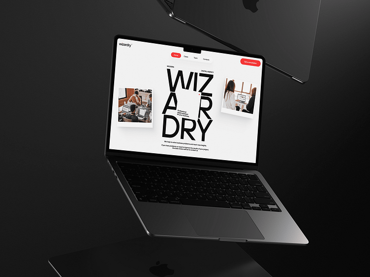
WIZARDRY - digital agency website
👋 Hey, guys!
Today's shot is a design for the main screen of the website of the modern digital agency WIZARDRY, the main direction of work is to help businesses develop in the digital environment. The design had to express modernity, lightness and have some kind of its own essence, to be remembered among many similar sites of agencies and at the same time not differ radically from the general stylistics in this field. This is exactly what I implemented on the screen above. A light theme, orange color psychologically associated with joy and the desire to achieve something new, contrasting typography and a game with a counterform - all this set a coherent style for a modern and stylish site, which you can see above.
I hope you will appreciate it ❤️.
---
⭐️ Have a project idea? Write me:
👉 Or better find me on:
