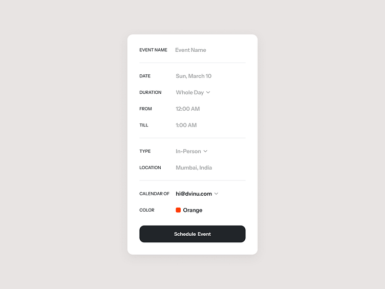
Add New Event
Here’s a breakdown of above design's UX strengths in simple terms:
Easy to skim and scan: The layout is clean and uncluttered, with clear headings and spaces between sections. This lets users find the information they need quickly, without feeling overwhelmed.
Dropdown menus save space: Instead of listing out every single detail, the modal uses dropdown menus. This keeps things concise and reduces clutter. Users can simply click the menu to see the available options.
Color-coded events: Events are displayed in different colors, which acts as a visual cue. This helps users distinguish between various event types at a glance.
Straightforward button: The “Schedule Event” button clearly indicates its purpose. Users won’t be left guessing what to do next.
Liked our work and want to work with us?
Email us at 📩 hi@dvinu.com or 📞schedule a call
---
Follow us on Dribbble • Twitter • LinkedIn
Visit our website 👉🏾[Dvinu.com]
