SORAE SPA | LOGO DESIGN & BRAND IDENTITY
The name SORAE in Japanese is a word that represents beauty. SORAE means deep blue sky, sparkling light, peaceful air.
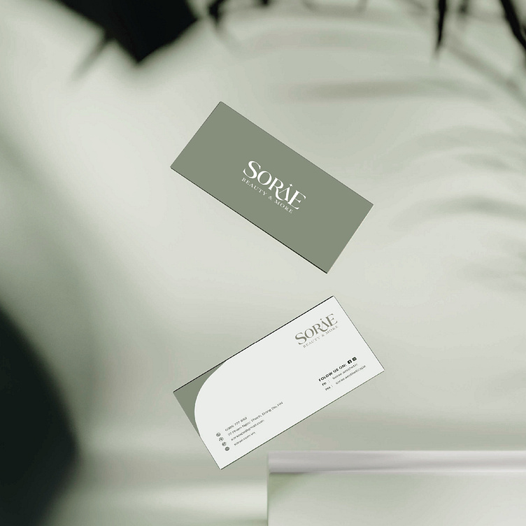
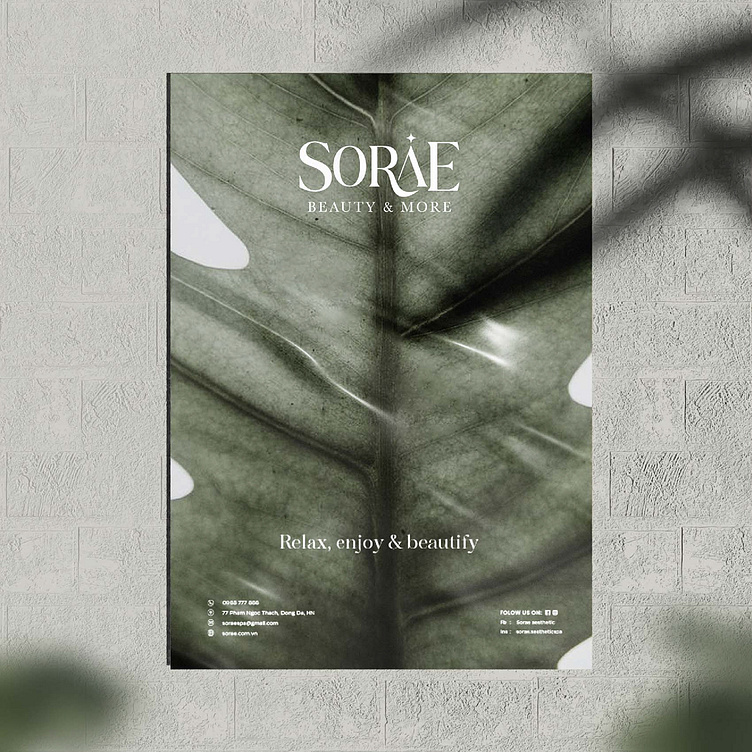
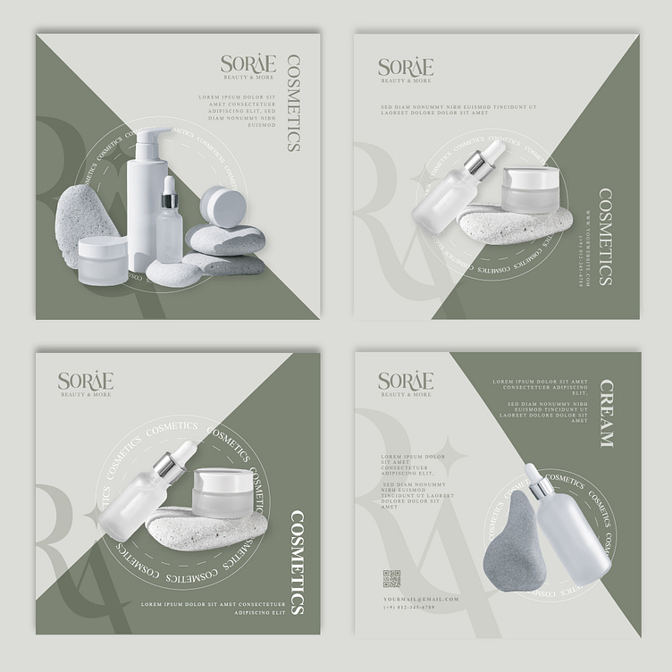
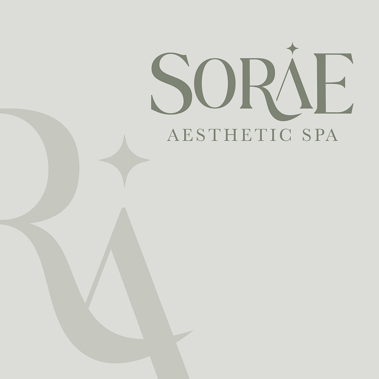
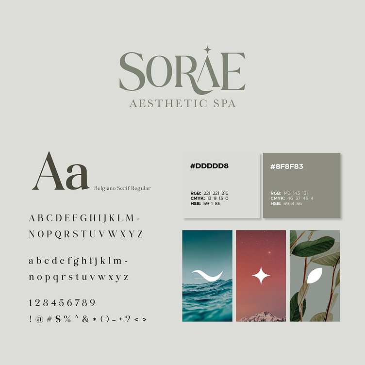
From that meaning, Bee Art has design SORAE's brand identity. With a logo designed in the direction of stylized letters, Bee Art has cleverly integrated the images of nature into the design. The overall SORAE logo brings a sense of elegance, naturalness, elegance and development, as well as exceptional care and attention to detail in beauty services.
The unique blue-gray color is skillfully coordinated, both bringing differences compared to other beauty salon brands on the market, while expressing the modernity, towards the natural beauty of Sorae Aesthetic Spa.
Designed by Bee Art
-
Client SORAE
Logo and Branding Project. Logo is designed for Beauty Spa in Vietnam.
Copyright © Bee Art. All Right Reserved
Contact us:
• Hotline/ Zalo: (+84) 77 34567 18
• Email: info@beeart.vn
• Website: www.beeart.vn
• Facebook: https://www.facebook.com/BeeArt.vn