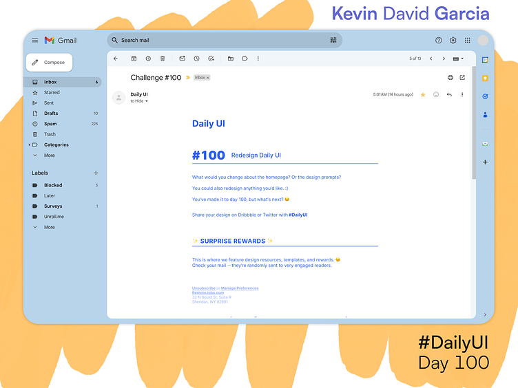
Day 100: Redesign Daily UI
Over the past 3 months, I've seen 100 of these emails. I appreciate their simple and easy-to-read design, so I wanted to keep it as much as possible.
On the dailyui.co website, there are a number of fonts used, but I decided to use the most prominently used one, Inter. I also left-aligned the text to improve reading, and reduced superfluous whitespace.
More by Kevin Garcia View profile
Like

