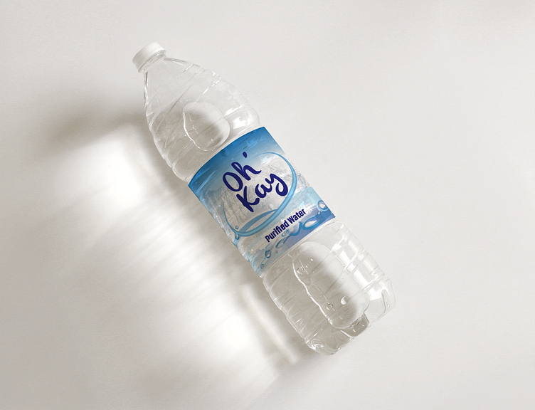
Water Bottle Label (Oh' Kay Purified Water)
This design showcases a minimalist yet impactful approach, utilizing a soothing color palette of blues and greens to evoke a sense of purity and freshness.
Brand Identity: The prominent display of the brand logo ensures instant recognition and brand association.
Informative Layout: Essential product details such as water type, volume, and unique selling points are strategically placed for easy readability.
Visual Appeal: Nature-inspired graphics and abstract patterns enhance the label's visual appeal, creating a connection with the natural elements.
Typography Choices: A combination of legible fonts for product information and stylish typography for branding elements adds a touch of sophistication.
Sustainability Focus: The design incorporates messaging highlighting the product's eco-friendly features, appealing to environmentally conscious consumers.
This water bottle label design exemplifies my ability to create visually engaging and purposeful packaging solutions that resonate with both brands and consumers. It represents a commitment to innovative design that not only captures attention but also communicates brand values effectively.
Open for new projects:
Email: nickyogechi@gmail.com
