Sharm el Sheikh
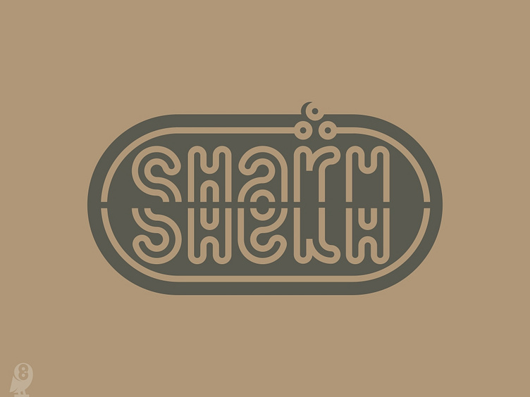
A complementary tourist logo for the city. Recently vacationed in Egypt. And was inspired by the actual identity of the city, I saw the similarity of the basic brand element to the Latin letter H. From there, my thought began to evolve and I tried to create an alternative polylingual version of the logo, Europeanized and tourist-friendly. The name of the city translates to Sheikh's Bay. With simple minimalist typography I conveyed the images of the sea bay, the magic reflection in the water, the month and the stars.