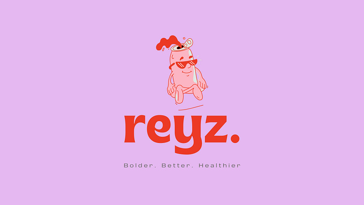
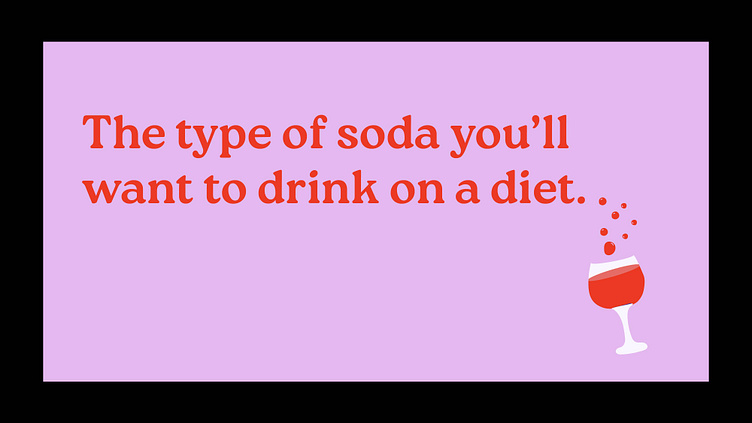
Reyz: The type of soda you’ll drink on a diet
It’s taken me months to sit down and write this — close to a year, to be precise. So buckle up, because it’s going to be a looong one.
Now, to give you a little background, I don’t like soda or any flavored drink, for that matter. It’s more of a taste and preference thing than for health benefits, though that also counts. I do drink on occasion, just to avoid unnecessary conversation with someone during a party or so. Regardless of my indifference, this was a project I couldn’t say NO to.
Disclaimer: Don’t mind the writing. I drank way tooo many sodas — more than I thought possible for one body to handle (actually, it was two), so this case study is a lot more outgoing. I’ve spilled my heart out.
Who knew soda could get you drunk?
Bolder, better, healthier
You ever wanted to enjoy a drink even when you’re deep into dieting?
Enter Reyz.
Reyz is a small brand with a big heart that loves to have a good time. They happen to be that buddy who never fails to infect others with their lively, approachable persona.
Their drinks are made so that you don’t have to worry about sugar and whatnot. It’s sweet enough to satisfy your tastebuds but doesn’t veer off in providing you with the necessary vitamins required to kickstart your dieting journey.
I know it sounds too good to be true, but stick with me for a while, will you?
The logo
Reyz is a super cool brand with a calm and refreshing demeanor. So yeah, no pressure at all. When it came to the visual identity, I wanted to create something that felt cool.
It had to be inviting yet unique. Given the many sodas you see these days, I wanted this mark to be inclusive and convey that feeling of coolness in every can out there. And what better way than a cool-looking mascot? (You’ll be reading a lot of coools, so bear with me 😅).
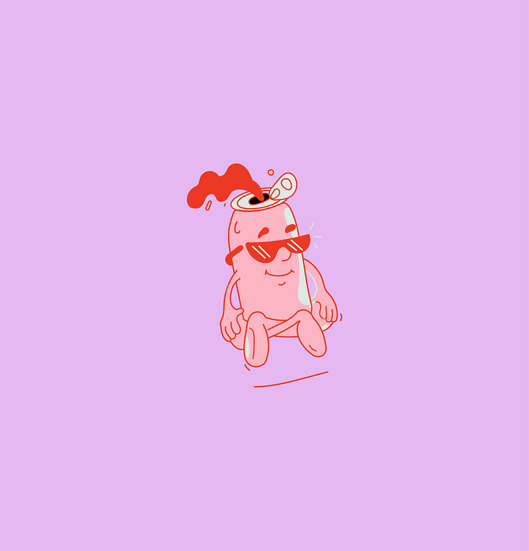
The mark I ended up going with is this personable, fun character — let’s call him Ray. The reason I chose him is because what’s not to love about mascots? They bring ‘life’ to an already existing brand and also because it fits well with the brand’s culture.
The target audience also happens to be livable and loves to connect and socialize over a soda or two. I figured the only way it would work was if I incorporated a character into it. That way, the mood is conveyed without a word being said.
A score for that one!
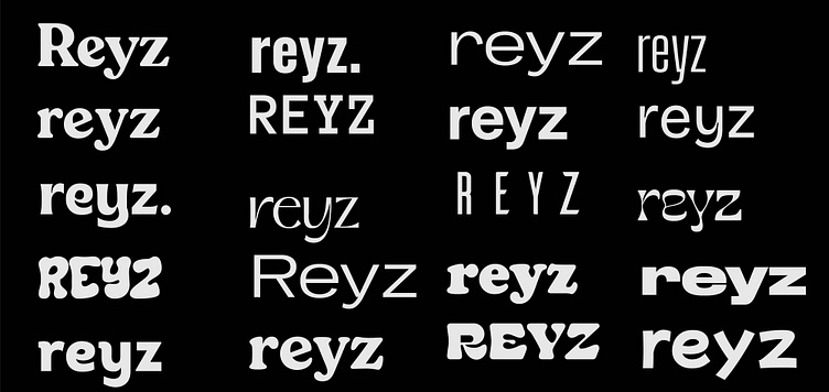
Having some fun with the type
Oook, now that the logo came together fairly quickly, I was like, hell yeah, this is gonna be dope!
Scratch that.
Here’s the thing. Choosing the right typeface is one part of the design process that strips me of my ego (and I got a big one!). Heh, just kidding.
Heaven knows how many times I’ve prayed to the type gods to find favor in my work — and sometimes, just sometimes, they listen. This time, I might have offended them or something because I spent days bashing my head against my desk. I could NOT figure out the right type that would work with the Reyz brand.
It got so bad that I had to step back for a week to get my creative juices up and running. Not to mention the number of sodas I bought (and drank, yikes!) just so that I could find a little bit of inspiration.
Hell, who am I kidding?
I knew I had little to no chance of scoring this when I signed up for the contract. I mean, how many soft drinks are out there, all fighting for the same market? It was a zero-sum game from the start.
But you know what? I stuck with it all the same because quitting just ain’t my style.
Twenty empty cans later…
You know that terrible feeling when you’re trying to be responsible and move a project forward, but deep down you know something’s not right, but you still go on? No? Yes? I don’t know, but one thing is for sure; I’m glad I stuck to my guns.
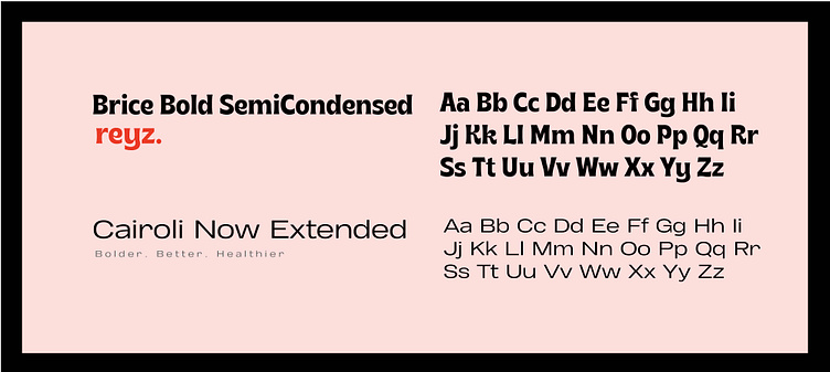
The wordmark is set in Brice Bold SemiCondensed. (Phew! That was a long one.) I wanted something that would complement the visual power of the mascot, and I think I nailed it. It’s bold, clear, and wavy in the right sort of way, suitable for the brand. So yeah, you can’t beat this.
The alternate wordmark is where things got a little wonky. I had two typefaces to choose from: Cairoli Now Extended and Roca Two, and the former won the mantle. That’s not to say I ditched Roca entirely; no, it happens to play a part too in the posters I created. I think this is the first time I’ve used three typefaces on a project. It doesn’t hurt to break a few rules here and there.
Colors
Did I mention that the whole branding process was a challenge? Man, I don’t remember the last time I had so many conflicting thoughts — and a soft drink, for that matter. Can you believe it? No? Me neither.
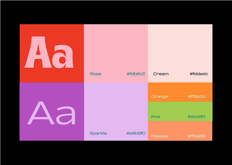
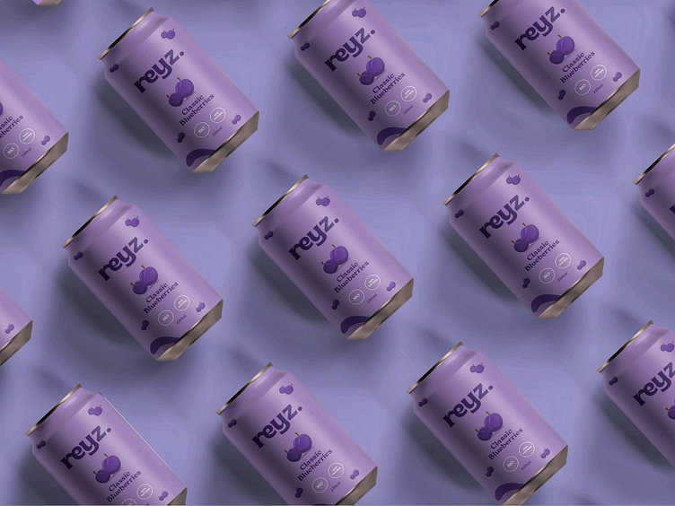
For color, I decided to do something a little different. Since Reyz offers drinks in two flavors: strawberry and blueberry, I created a color palette that would evolve with time. In case the brand ever needed to introduce a new product, say green apples, they wouldn’t have to worry about rebranding. The color palette will live and adapt to the changes, so they don’t have to worry about versatility, at least not for now.
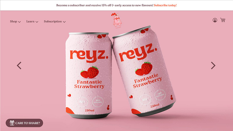
Packaging design
Ah, let’s get to the nitty-gritty stuff, shall we? When it comes to packaging, the soft drink industry is all over the place. All kinds of boxes, bottles, cans, and whatnot. Heck, the stuff you buy online? I couldn’t tell you.
All I know is that for this particular brand, I wanted to create something that would tell a story of its own. Something that, if you’d place it side by side with Coca-Cola, you’d pick up without a second hesitation. (The health benefits do help, you know.)
I thought of tossing that understated ‘The type of soda you’d drink on a diet’ into their packaging as well. How do you incorporate the need for a healthy drink while still maintaining that special feeling of fun?
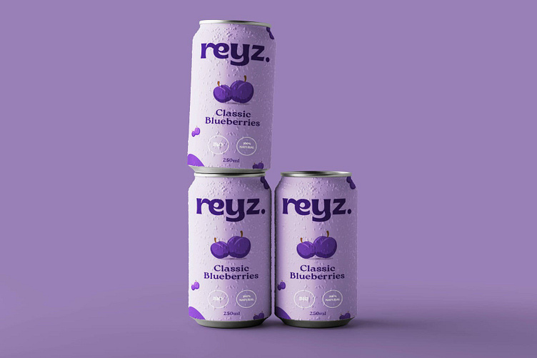
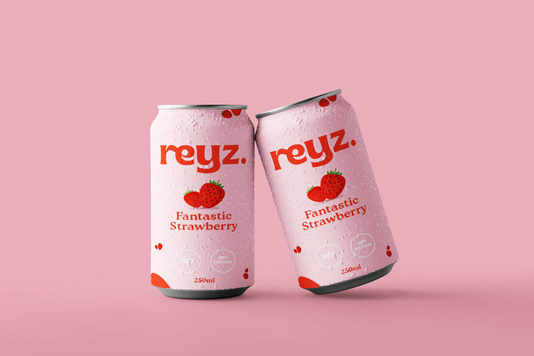
Of course, I did it the only way I thought would strike a chord between the two. For each flavored drink, I splashed their respective ingredient across the whole packaging. Groundbreaking, earth-shattering, I know. But in all honesty, I loved the idea of having strawberries fall all over the cover design because it gave this natural feel of drinking something good for your health.
And the results gave this beautiful pattern that I think would work just as great on the cartons or boxes that the cans came with.
I really tried to make sure that the design didn’t feel cluttered, but I also made sure that the feeling of drinking it or even having it in your possession felt like a delightful process. I wanted the can to be one of those items you wouldn’t want to throw away because it’s beautiful and slick.
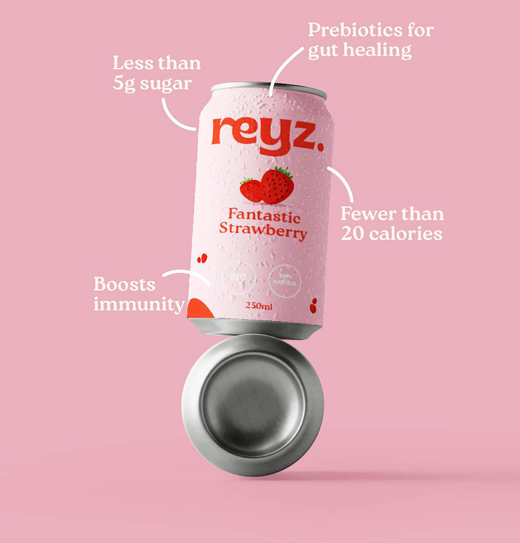
Instead of naming the product strawberry, I thought I’d make it more interesting. So I put ‘Fantastic Strawberry’ — rhymes well. That way, when you drink one, you get that same feeling over and over until the last drop.
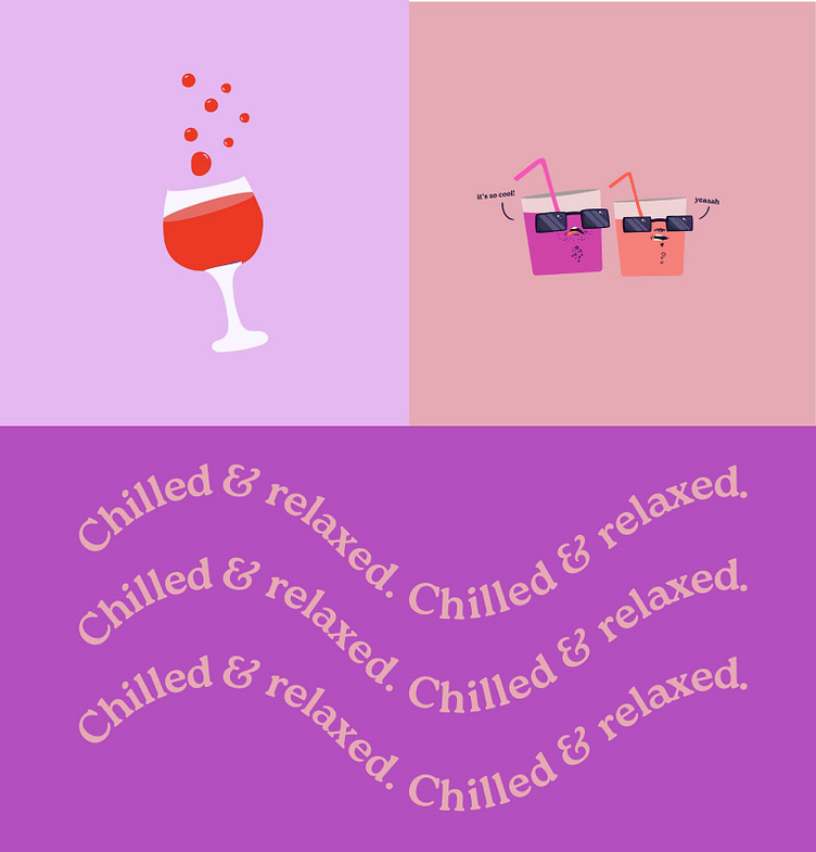
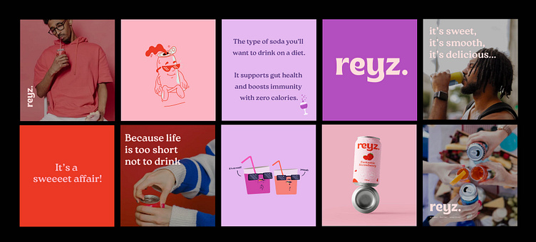
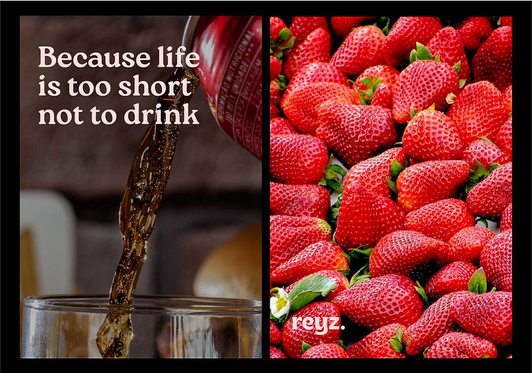
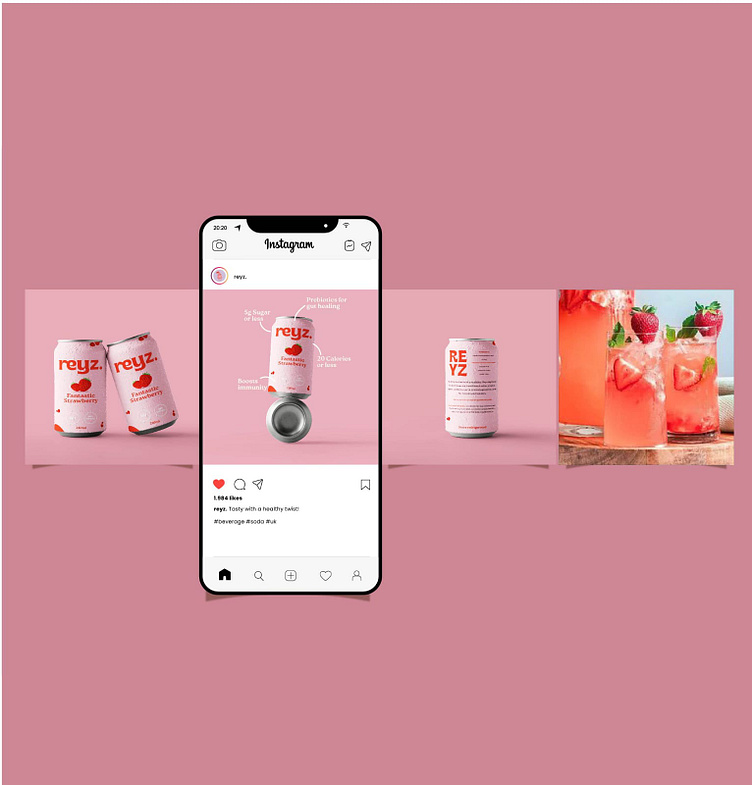
Spreading fun around the world
I had so much fun pulling reference photos for this. It took a while to get things feeling right, and some didn’t cut to the chase. For the posters, I brainstormed some ideas or two (over a can of soda) to get things rollin’ and I can’t say I did bad. After all, the branding speaks for itself.
Once in a while, I present website mockups in my branding portfolio, and honestly, I don’t know much about websites. Mine’s up and running, but that’s all it does. I’m thinking of outsourcing that part soon.
In this case, I created a landing page that showcased one of their products from end to end. Nothing else. Except for the obvious sidebars to let you browse other products on offer, an add-to-cart icon, and a coupon voucher for extra goodies.
They loooved it! How COOL.
Let’s talk over a can or two, shall we?
Overall, I’m happy with how things turned out, although deep down I know I could do better (my imposter syndrome is screaming at me!) I hope the customers love it because, damn, the sugar rush! All of that trouble for YOU. Gimme some credit, will you?
I also hope you enjoyed this case study. ( I did mention a lot of ‘coools’ now, did I?) It takes me some time to write each piece, but I do my best to share my creative process. If you love what I do or just wanna hang out, reach out to: cindywachu8@gmail.com. Again, special thanks for reading this. You’re the coooolest person 🙂.
