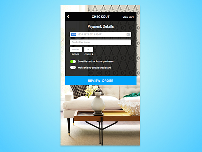
Daily UI 002 | Credit Card Checkout
My first Dribbble shot! This is for the Daily UI challenge- Day 002, a credit card payment form. I did mine in mobile, because I've been buying a lot in mobile lately and I hate how complicated the credit card input always is. Tried to keep this very simple and something you could get through quickly.
More by Clarity Design View profile
Like

