Monarch Brand Identity Design
Case Study: Monarch Design Brand Identity
Client: Monarch Design (Graphic Design Company)
Objective: Develop a brand identity that reflects Monarch Design's professionalism, creativity, and impactful design approach.
Solution: A sophisticated and versatile brand identity was created utilizing a core color palette of black and white, accented by vibrant orange and blue.
Logo Design:
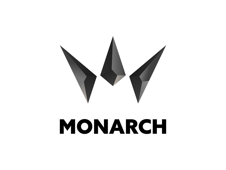
The logo is a symbolic representation of a king's crown, meticulously crafted from a crystal pattern. This design choice signifies the company's commitment to:
Quality: The intricate crystal pattern evokes a sense of precision, detail, and high-end design.
Rarity: The crown symbol underscores the uniqueness and impactful nature of Monarch Design's work.
Color Palette:
Primary Colors:
Black: Represents professionalism, sophistication, and a timeless quality.
White: Symbolizes clean design, clarity, and a fresh perspective.
Secondary Colors:
Orange: Injects a burst of creativity, energy, and a touch of playfulness.
Blue: Denotes trust, reliability, and inspires confidence.
Typography:
Azo Sans was chosen as the primary typeface for its modern aesthetic
Azo Sans' geometric construction with humanistic touches creates a balance between professionalism and approachability, aligning perfectly with Monarch Design's brand image.
The typeface offers a clean and legible appearance for both headings and body text, ensuring clear communication across all design applications.
Imagery:
Illustrations: Custom illustrations will be included that are modern and minimalistic in style. These illustrations can depict various design concepts or metaphors to visually communicate Monarch Design's services. The use of black, white, orange, and blue will ensure visual consistency with the brand identity.
Minimalistic Patterns: Subtle geometric or organic patterns are incorporated into the design elements to add a touch of visual interest without overwhelming the clean aesthetic. These patterns are derived from the crystal motif of the logo for additional brand cohesion.
Applications:
The brand identity will be applied across all Monarch Design touchpoints, including:
Website
Business Cards
Marketing Materials
Social Media
Presentations
Results:
The Monarch Design brand identity conveys a strong sense of professionalism and expertise, highlighted by the black and white color scheme. The crystal crown logo and pops of orange and blue add a layer of sophistication, creativity, and a touch of vibrancy. The use of Azo Sans reinforces the modern and approachable nature of the brand. Modern illustrations and minimalistic patterns will further enhance the visual storytelling, effectively communicating Monarch Design's creative approach and design capabilities. This cohesive visual language will resonate with potential clients seeking a design partner who is both trustworthy and capable of delivering exceptional work.
Conclusion:
The Monarch Design brand identity is a strategic visual representation that effectively communicates the company's core values and positions them as a leader in the graphic design industry, known for crafting high-quality, impactful designs with a modern and creative touch.


