Wellfit - Training and Fitness App UI / UX
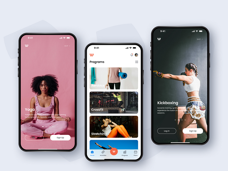
💪 Hey Dribbblers! Get ready to feast your eyes on the stunning design of "WellFit" – your ultimate training and fitness ally! 🚀🏋️♂️
🎨 Design Delight: Exploring "WellFit" Aesthetics
⚪ A Canvas of Cleanliness: With a pristine white base, "WellFit" embodies purity and clarity, providing the perfect backdrop for your fitness journey. Every element breathes freshness and simplicity, ensuring a seamless user experience.
🔠 Text & Icon Harmony: In the world of "WellFit," text comes alive in #252525 – a shade that exudes sophistication and readability. Secondary text and icons, adorned in #494D58, strike the perfect balance between subtlety and prominence, guiding users with effortless elegance.
🎨 Vibrant Pops of Color:
Primary Passion: Embracing the fiery energy of #F26749, our primary color ignites motivation and drive. It's the spark that fuels your workout sessions, infusing every moment with intensity and purpose.
Splash of Adventure: Dive into the deep blue depths of #2B90ED – our secondary color that embodies adventure and vitality. Like a refreshing dip after a grueling workout, it adds a splash of excitement to your fitness journey.
🌟 Design Philosophy: Beauty in Simplicity At "WellFit," we believe in the power of simplicity to elevate the user experience. Every color, every line, every detail is meticulously crafted to create a visual symphony that inspires, motivates, and invigorates.
