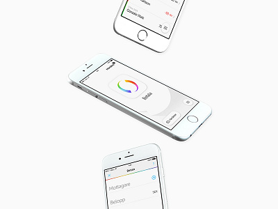
Swish redesign (Payment confirmation)


When Swish launched 3 years ago, it was only a C2C service but have since then evolved into also supporting C2B and in a near future E- and M-Com.
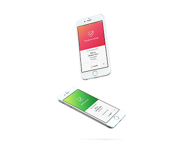
With that said, the confirmation screen needs to be adjustable for the various of information that needs to be display. The new design system caters for the various information depending on the payment. We also added a neat and friendly feature to distinguish a normal payment from a charity payment.
The confirmation page is also now animated together with a security layer—making it easy for a business to live validate a confirmation screen. A video of this flow will be added here later.