Swish redesign (Intro)
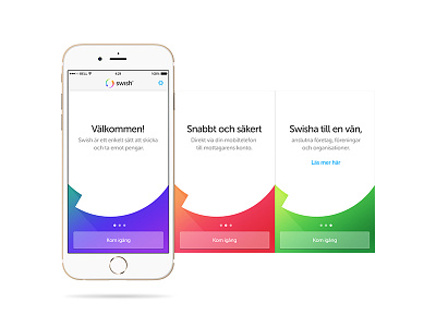


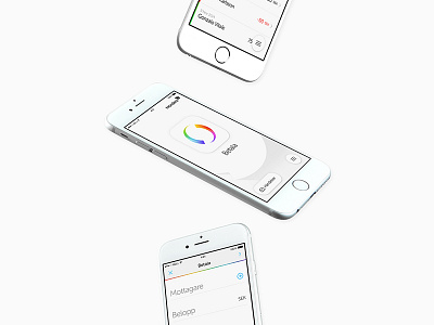
In the redesign of Swish we wanted to have a tangible brightness throughout the app—a white yet vivid layout. We felt that the current gradients was a bit on the dull side and we wanted to boost those to get a more colorful energy. A yummy one.
The ID shape is now also more present than before.