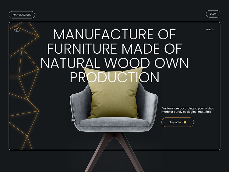
Manufacture Company | Landing Page Design
Hello Dribbble!❤️
Website design for a premium furniture manufacturing company that uses natural wood and has its own workshops for its processing
Solution
We designed the website in dark colors with golden inserts to emphasize the sophistication and premium nature of the company and create a wow effect. The site is full of various functional features, such as endless carousels. It has a broken grid to create visual integrity and direct the user's attention to the necessary elements of the site. It has a lower navigation bar that is easier to access.
When analyzing the target audience and to avoid overloading the call center, in order to increase the conversion of the site into sales, we filled each block with content that answers the main questions of the user: "What is furniture made of?", "How does the process go?" "Is it long in terms of time", "What services do you provide?", etc.
Thus, we were able to achieve a 21% increase in sales from the website and a 43% increase in the number of sales calls, so we avoided calls asking "How do you do this, etc."
Responsive Mobile Design
We are open for new projects in your work field!
Just contact us!
✉️ Email: misha.konoval.design@gmail.com
✈️ Telegram: t.me/mykhailo_konoval
📞 Whatsapp: +380960486246
📷 Instagram: @mykhailo.konoval


