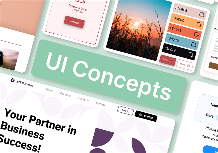
Daily UI Challenge · #051 - #060
Explore my designs from the fifty-first to the sixtieth, created as part of the Daily UI challenge! Every day, I take on the challenge of crafting a unique user interface, exploring a variety of concepts and styles. From minimalist to vibrant designs, these creations reflect my passion for UI/UX and my commitment to improving every day. Join me on this creative journey where each day brings new challenges and discoveries. Follow along on Behance for this captivating design adventure!
#DailyUI #UIDesign #UXDesign
Challenge #051
Prompt: Press Page
Create a Press Page design. Think about who you are representing and what important information you should convey. Is it for a new startup? A huge global brand? A nonprofit organization? Or a small local business? Or is it actually for a person such as a celebrity, athlete, politician, etc.?
Challenge #052
Prompt: Logo Design
Will it be animated? In what capacity will it be used?
Branding is generally a serious matter for most companies and the considerations for size, placement, color, etc. should be thought out carefully.
The biggest brands don't always have the best logos. A great logo is one that compliments a specific purpose and not necessarily a generic image or name. For example, Nike uses a swoosh which shows motion and speed - core parts of their running image. Mailchimp showcases a monkey rather than an “email” icon and it adds depth and character to their brand.
Challenge #053
Prompt: Website Navigation
Most websites have a navbar that's stuffed with links and logos.
What could you design that's both functional and appealing? How could you make it unique?
Challenge #054
Prompt: Confirmation
Design a Confirmation UI element. What's being confirmed? Is it confirming an address, order, shipping, plane tickets, hotel reservation, dinner reservation, booking tickets to the opera, or something else? Also consider where it's occurring (i.e. website, mobile app, email confirmation, etc.)
Challenge #055
Prompt: Icon Set
Create some icons to be used together. It could be for a taskbar, showcasing features or services, or even for something like a shopping app. (Icons might be a cart, a shipping box, a size icon, etc.)
Challenge #056
Prompt: Breadcrumbs
Every interaction on a website or within an app is an opportunity.
Although a seemingly small detail, breadcrumbs are very necessary and yet often neglected in terms of their appearance and functionality. To truly achieve great design sense you need to consider even the smallest details.
Challenge #057
Prompt: Video Player
Design a video play with all the functions needed: volume, skip, fast forward, etc. Depending on the device you'll want to consider different needs such as inputs for a TV (HDMI 1, etc.) or hover effects for a remote cursor.
Challenge #058
Prompt: Shopping cart
Some brands use a cart or bag during their checkout process. Consider the products, prices, and placement of any other required data. Do people need to create an account? Checkout as a guest? Is there shipping?
Challenge #059
Prompt: Background Pattern
Whether an e-commerce site, a blogs, or a landing page, backgrounds are often unnoticed. How can you design a useful and beautiful one?
Video background? Moving patterns or textures? You decide.
Challenge #060
Prompt: Color Picker
What is the user doing? Designing a website? Selecting a t-shirt color?
Colors are an important part of product design and making it simple to select great color schemes is crucial.


