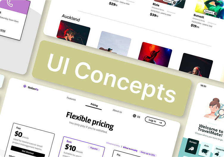
Daily UI Challenge · #021 - #030
Explore my designs from the twenty-first to the thirtieth, created as part of the Daily UI challenge! Every day, I take on the challenge of crafting a unique user interface, exploring a variety of concepts and styles. From minimalist to vibrant designs, these creations reflect my passion for UI/UX and my commitment to improving every day. Join me on this creative journey where each day brings new challenges and discoveries. Follow along on Behance for this captivating design adventure!
#DailyUI #UIDesign #UXDesign
Challenge #021
Prompt: Home Monitoring Dashboard
Design a home monitoring dashboard. Be creative! What would make a dashboard visually appealing and fun to use, while also being mindful of its function?
Try to make it a realistic exercise as if it were your own dashboard... one that you need to refer to daily. What is the most relevant data and what's the most appropriate placement for it?
Challenge #022
Prompt: Search
Design something search related. It could be a search bar, an advanced search window, or a search function. It could even be a page to search for hotel rooms, homes for sale, plane tickets, concert seats, or something else.
Challenge #023
Prompt: Onboarding
Are you recruiting people for an organization? Are people signing up for a new service or website? Is it welcoming people into a mobile app?
Onboarding might seem trivial, but it's the first experience your users have with your product or service. It's like the first page of a book and it can instantly excite them. If not implemented well, a bad onboarding experience could turn someone off of a brand completely.
Challenge #024
Prompt: Boarding Pass
Consider the origin, the destination, gates, seats, the airline, etc.
Is it for a multi-stop trip, round-trip, or one-way journey?
Boarding passes are sometimes used to promote additional information such as credit card offers, frequent flyer programs, or partner deals with local hotels and resorts.
Challenge #025
Prompt: TV App
What type of app is it? What are the features/controls such as volume, favorites, closed captions, or other languages? Does it have a carousel selection feature?
Would it be important to have a “Continue Watching” area? Or other recommendations such as most viewed, recently added, etc.?
Challenge #026
Prompt: Subscribe
What is a person subscribing to? A streaming service, a video course, or a consultation service? Is it just a button or a widget?
What type of information are you looking to capture from the user? Their name and email? Their country, state, or postal code? Age consent? Something else?
Challenge #027
Prompt: Dropdown
Is it a menu dropdown? Or a tip that's dropped down during a tutorial? Or inside of a software tool to show more features?
What extra information is displayed? The current price of gold? A login/logout button? Menu selections?
Challenge #028
Prompt: Contact Page
Is it for customer support? A purchase inquiry? To schedule an appointment? Is it a full page or just a form? Imagine a scenario and the most important feature it would require.
Contact pages are some of the most visited pages on websites so it's important to have the most critical information, but not so much that people get lost.
Challenge #029
Prompt: Map Design
Not one of those old school paper ones though. Actually, that might be kinda neat. ;)
What type of information should it have? Should its color scheme compliment the brand? Is it for food delivery? Or an interactive map of train stations?
Challenge #030
Prompt: Pricing
Is it a pricing table for a SaaS website? An in-app purchase? Or upgrade options for a restaurant menu?
Displaying prices in an easy-to-read format is a good design and business practice. Make the price obvious and don't try to hide anything. Overly complex pricing tables or designs create confusion and consequently a lack of trust… bad for both business and design.


