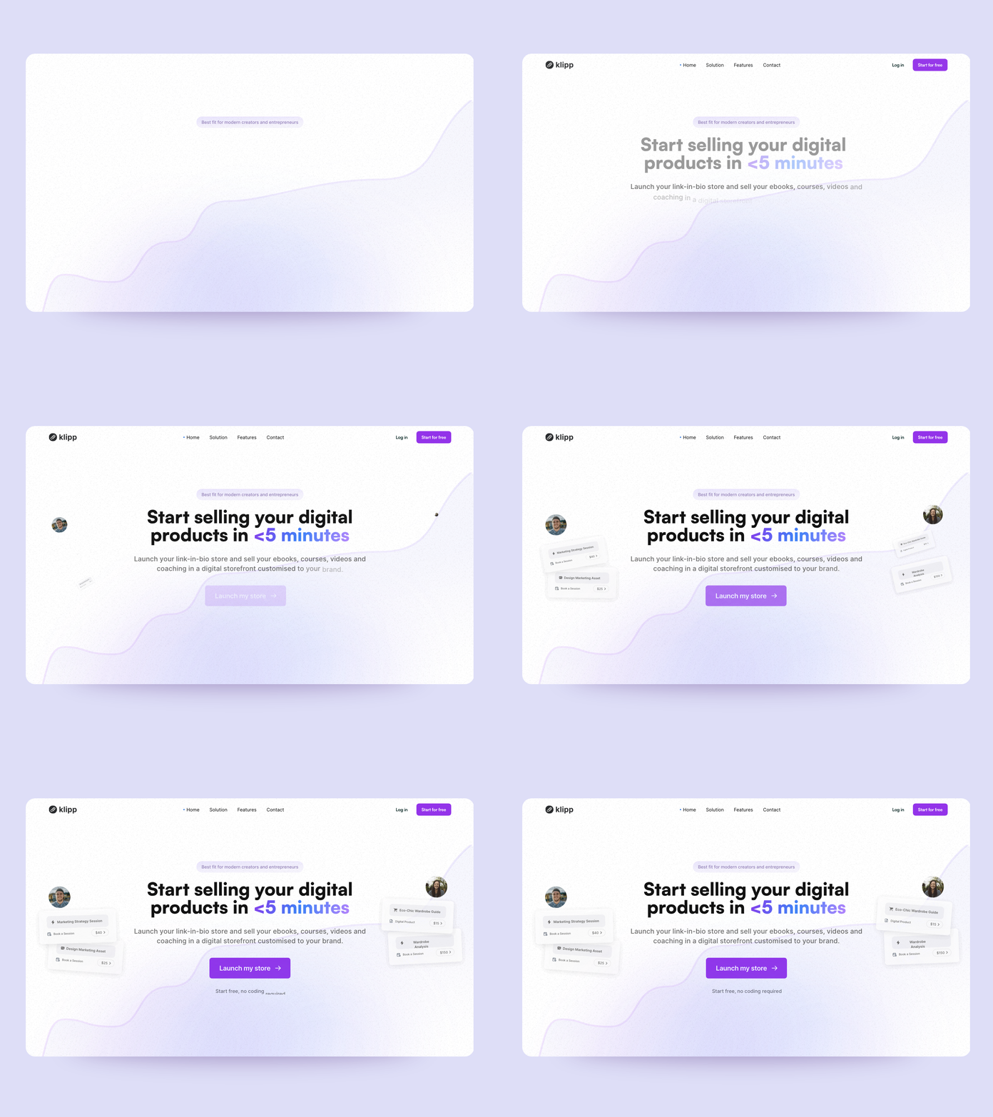
Klipp — landing page redesign
Hey there! Happy to share with you my last shot for Klipp.io app!
Can I share a quick story here?
Last Wednesday we launched a small promo for our new service at Salt & Bold. We suggested some free redesigns on Twitter if people left a comment.
We've posted such things before and received 5-7-10 requests, so I expected the same this time. I thought, "Okay, I have 2.5 days for several landing pages. Not a big problem."
But 8 hours later, we saw over +100 followers, 200+ likes, 150+ bookmarks, and...80+ requests!!!
So soon we'll have an endless amount of shots for Dribbble
Above you can see an old screenshot from the website. Pretty simple page. But I love this gradient so decided to leave it.
And below is what I ended up with!
Added demo, so people know what the app is about from the first screen
Updated texts, which better describes the value
Add valuable info (best fit for..., free, no dev required)
Rearranged buttons in header
BG noise and a little fun


