Stance | CRO
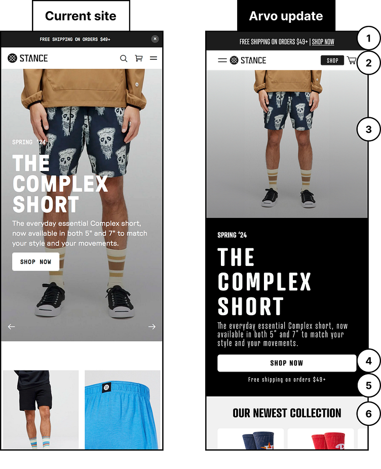
I collect one thing and one thing only, and that is Stance socks. I currently am sitting at 3 drawers of my dresser full of 154 pairs. It started a few years ago when I was working in an office and I wanted to wear something unique without totally standing out. Today I work remote but still wear them everyday and for all occasions. As a value add, I isolated 6 quick wins for the website. See below for the breakdown!
1) Let’s make good use of the announcement bar by including a direct call to action to get users into the purchase funnel easily.
2) Experiment with adding a shop CTA into the main navigation. Also ensure that key buttons are separated to reduce misclicks and frustration for your users.
3) Make sure your hero message and hero image aren’t competing against each other by allowing them to be separated. Give users the visual information without distractions.
4) Make sure your CTA’s are full width on mobile so that users can easily click on the desired links.
5) Highlight your incentive to purchase right under the CTA to help convert people who may be on the edge of making a purchase.
6) Let’s try moving your newest products higher up on the page. Give them the highlight they deserve. This will ensure that users can jump directly to those featured product pages.
