Level Nine - Website Redesign, Mega Menu
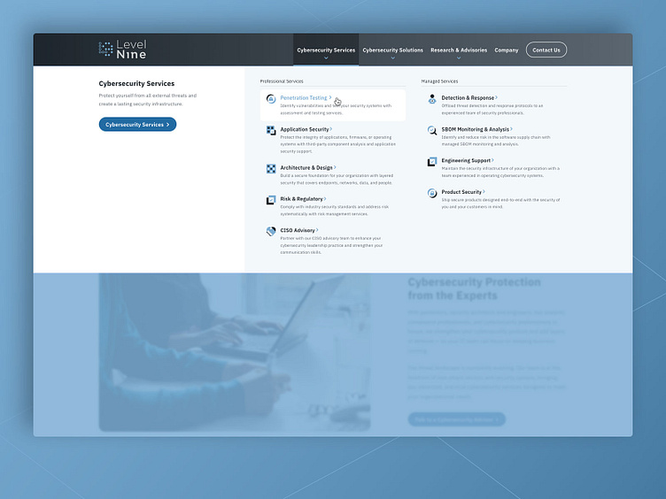
For the Level Nine website redesign project, we designed and developed an intuitive mega menu that restates the primary nav item in the left-hand column, while cleanly showcasing the child pages in the remaining 2 columns.
This approach is highly successful because the left-hand column provides context for all the other "child" nav items/pages... In this example, in the left-hand column, the paragraph text under "Cybersecurity Services" adds useful context to this whole mega menu tray, along with a call to action. Visually, we establish some subtle hierarchy with the shift in background color, as the left-hand column is on white, and the "child" nav items/pages are on the light gray.
For the "child" nav items/pages, we've created an opportunity for the admin to write in a useful description, and to upload a custom icon. For additional segmentation, we designed and developed a solution to group different "child" pages with the clean label... "Professional Services" and "Managed Services" in the shot above.
Another subtle treatment is creating this blue overlay that appears just beneath the mega menu tray, but over the page content, to add some separation between the two, increasing priority on the mega menu which the user is currently engaging with.
