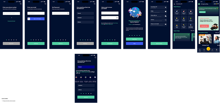
EduFund's Onboarding - Redesign using Spotify's design language
Problem Statement:
Re-design EduFund's Onboarding Journey using Spotify's design language
Spotify’s Onboarding Flow - Key Design observations:
Minimalist Interface & Progressive Disclosure: The onboarding screens feature a clean and minimalist design with ample whitespace, while
gradually introducing users to its features and functionalities over multiple onboarding screens and thus, making it easy for users to focus
on essential elements. For example, only one CTA like entering Email, Create Password, etc., per screen.
Consistent Branding: By using the same color palette, typography, and iconography throughout ensures a consistent branding which
reinforces brand recognition and fosters trust among users. For example, majorly using Green & Black from their logo across all screens.
Visual Storytelling: Spotify uses visuals, such as album covers or artist images, to convey the brand's identity and create an immersive
onboarding experience. Visual storytelling plays a crucial role in engaging users and sparking their interest in exploring the platform
further.
Personalisation: Spotify tailors the onboarding experience to each user by prompting them to select their favorite genres, artists, or songs
during the sign-up process or even notification personalization. This helps create a sense of ownership and relevance from the start.
