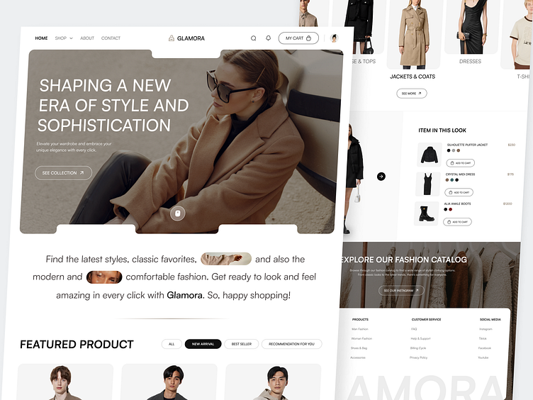
Glamora - Fashion Commerce Landing Page
Hello Dribbbles 🏀
I am excited to share the Landing Page Design I've been working on about Fashion Commerce called Glamora.
Overview
Glamora is a fashion commerce website that involves to creating attractive and easy-to-use online platforms specifically for buying clothes, shoes, and accessories. These websites are designed to look great and work well, making it fun and simple for people to shop for fashion items online. They include things like easy-to-find menus, big pictures of the products, and simple ways to buy things.
So, check this out! 👇
Challenge 🔥
Designing a fashion commerce website presents a unique challenge of blending style with functionality. Success in fashion commerce web design lies in effectively marrying aesthetics with usability to create an immersive and satisfying shopping journey that leaves a lasting impression.
Result
For the result of my design, I get my references from several designs on Pinterest and Dribbble and also got asset from Versace, Voila, and Uniqlo . Embracing a clean, modern, and user friendly design, I opted for the primary color Light Brown. This color is make aesthetic and warm tone in the website.
Color & Typography 🎨
Yay, this Mockup is my absolute favorite! 🤩
This is my preferred mockup. This is how I make a style mockup. With the Macbook mockup, it appears to be Modern and Professional.
❤️ Love this project? Show your appreciation with a like! Thank you for your support!
We are available for an E-commerce Website, Marketplace, Fashion Commerce Platform, and other similar projects. Want to collaborate?
Email us: hello@elux.space.
....................................................................................................................................................................
Check us more at:
📷 Instagram | 🖥️ Website | 📧 Email | 📍 UI8 | 📌 Creative Market | 🔥 Gumroad


