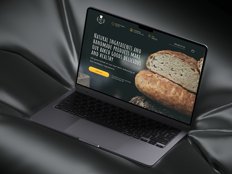
Bakery | Landing Page Design | UI/UX
Welcome, Dribbblers!
Landing page concept design for a bakery that is engaged in home production of natural products. The site is designed to be user-friendly for all type of customers
About
The site was designed in light colors to bring a sense of kindness and lightness. Gold ornaments were used to associate with premiumity and a flavorful bread crust.
Since the target audience of this site is women, mothers, and grandmothers, the development was based on the ease of reading information and supporting it with clear and informative illustrations, photos, or icons. We tried to minimize the number of any elements that could distract or create unnecessary workload
Responsive Mobile Design
Every single element of this site has been adapted and modified (if necessary), for easier use for all sizes of devices, especially phones. According to research, 70-80% of the target audience of this website use their mobile phone to visit the site and order products
We are open for new projects in your work field!
Just contact us!
✉️ Email: misha.konoval.design@gmail.com
✈️ Telegram: t.me/mykhailo_konoval
📞 Whatsapp: +380960486246
📷 Instagram: @mykhailo.konoval


