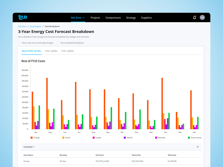
Data Visualisation: Multiple Bar Chart
Are you using the best data visualisation to show your data? 📊
When choosing the right type of visualisation, it's crucial to prioritise accuracy and clarity over aesthetics. Sometimes what looks visually appealing may not accurately represent the data or be the most effective in conveying information to users. We need to consider various factors, including how easy it will be for users to read and understand the data we are trying to communicate.
For instance, in the redesign of the 3-Year Energy Cost Forecast Breakdown screen for Open Energy Market, our goal was to provide users with a detailed forecast by charges and contracts. Instead of relying on traditional stacked bar charts, we opted for multiple bar charts. By ensuring each variable starts at the same baseline, we simplify data interpretation for users. This approach eliminates the need for users to mentally calculate differences between stacked values, resulting in a more intuitive and user-friendly experience.
Plus, we've utilised a vibrant color palette, making it easy to distinguish between data points at a glance. Take a look and let me know what you think! 🚀
#DataVisualisation #UXDesign #OpenEnergyMarket
