Massovka / Integrated brand development
Task. Massovka is a chain of fashionable clothing stores in a low price segment. Street retail with a huge assortment and the stores are located in the regional centers and the towns of Russia. During the research, it became clear that the consumers want to buy inexpensive, beautiful clothes that don't look cheap. They do not pay attention to the quality as they are limited in funds, the main task is to look like buyers of middle price segment stores, but for less money.
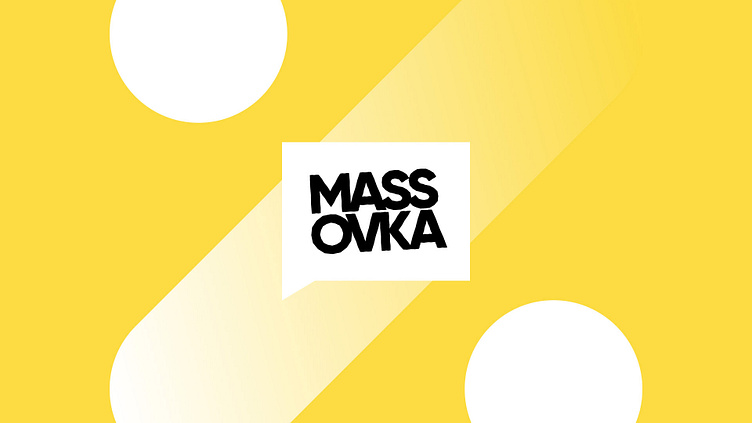
Solution. Brand strategy, verbal and visual identity were developed. The concept is the "zone of eternal discounts", the idea is that the prices are so low that it seems there is an eternal discount. The logo has a shape of a location marker and seems to show where you can save money. The corporate pattern based on the percent sign and the abundance of yellow, in its turn, continues the topic of discounts. And the slogans "the same" and "is cheaper than it seems" reinforce the idea and make the consumer think he is in the right place.
Thanks for watching! If you liked it, don't forget to hit that "Like" button, drop a comment, and share it with your friends – it really means a lot!


