Ballet Website Sign Up Concept Design
Hi everyone!😊
Rach is here to unveil my design concept for a ballet school website that has a community to join. This is my learning and exploration for Daily UI Challenge.

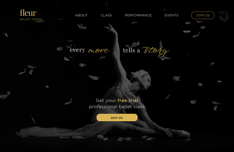
Landing Page
The landing page is carefully designed to show only the necessary navigation that aligns with user needs and the brand identity. I utilise a proper amount of negative space to make the design breathable, elegant, and focused to the CTA button.
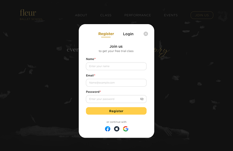
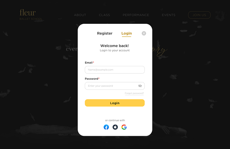
Register Modal
The register and login modal is shown when the CTA button was pressed. I decided to make the option of Register and Login in one modal using segmented control to ease user when changing between Register and Login.
Instead of using "Sign Up" and "Sign In" I use "Register" and "Login" to reduce cognitive load.
Thank you for reading!✨
I'm a freelance designer and feel free to reach me for any opportunities🌻
🎨 My Portfolio (open with laptop/pc for best experience)
