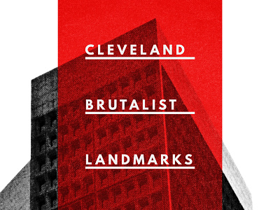
Building a brutalist conference poster
I wrote a poster design tutorial for the good peeps at @Go Media.
It focuses on a (fake) brutalist architecture conference, and on the possibilities offered by @Jason Carne's sweet Texture Lot One pack.
Cleveland has a bunch of brutalist landmarks, which means that I was able to make a CLE-centric piece.
The only regret I have? Not writing every instance of "brutalist" as "BRVTALIST."
I hope you enjoy the tutorial!
And, and a better view of the outcome is visible in the attachments.
More by Simon Hartmann View profile
Like


