🌟 Booking.com Redesign Concept In Figma
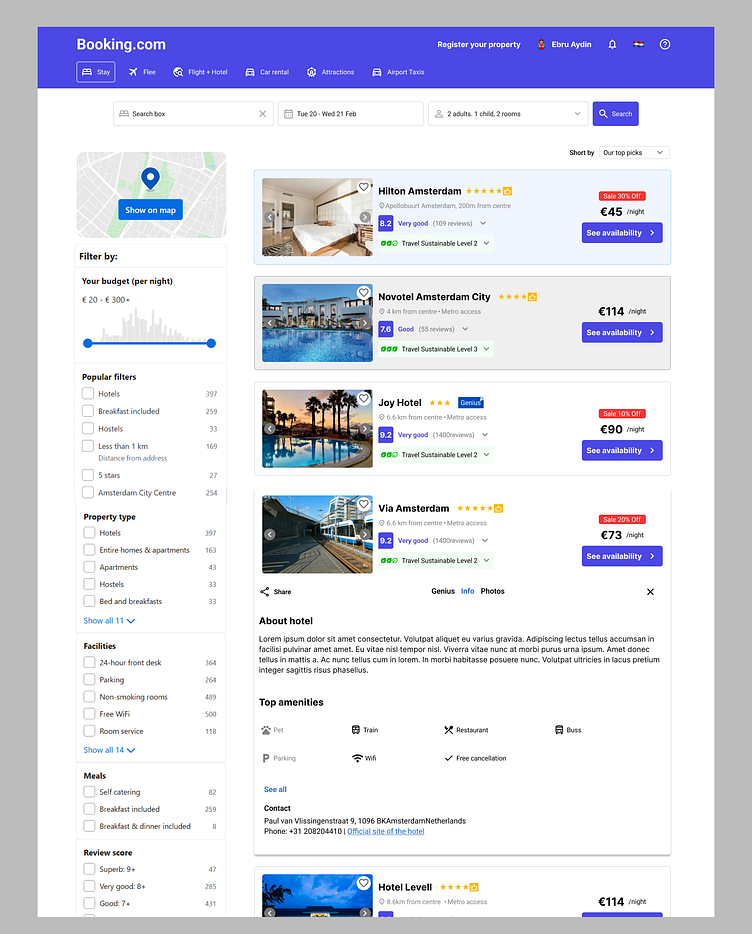
Header Section:
Visually enhanced header layout with relocated buttons for improved aesthetics.
Language, currency, and customer service links shifted to the right corner for a cleaner look.
💼 Search Box:
Search box repositioned lower for better accessibility and intuitive user experience.
Subtle background color refinement for enhanced visual appeal.
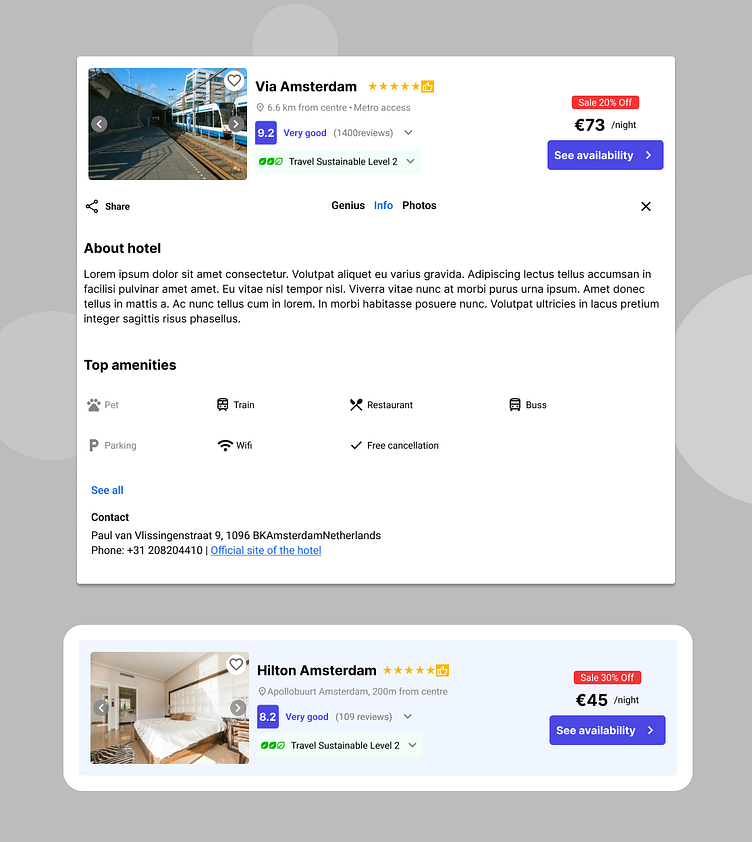
🏨 Hotel Section:
Streamlined hotel card layout for improved user interface.
Proposed adjustments to enhance visual hierarchy and reduce clutter.
Visual references provided for proposed enhancements.
🛒 Hotel Cart:
Visual enhancement with eco-friendly indicators below hotel descriptions.
Clear representation of eco-friendliness and proximity to public transportation.
🖼️ Hotel Image Gallery:
Expanded display with intuitive navigation icons for seamless exploration.
Qualitative labeling for quick evaluation of hotel quality.
🔍 Trivago-Inspired Review Section:
Collapsible review section for a clean and clutter-free presentation.
Seamless blend of visual content and informative reviews.
📝 Expanded Section:
Enriched user understanding with details on eco-friendliness, distance to city center, and nearby landmarks.
Comprehensive hub of information for informed decision-making.
💎 The Genius Program:
Small refinement for visual placement within the logo.