New Top Menu Bar Navigation IA Information Architecture Update
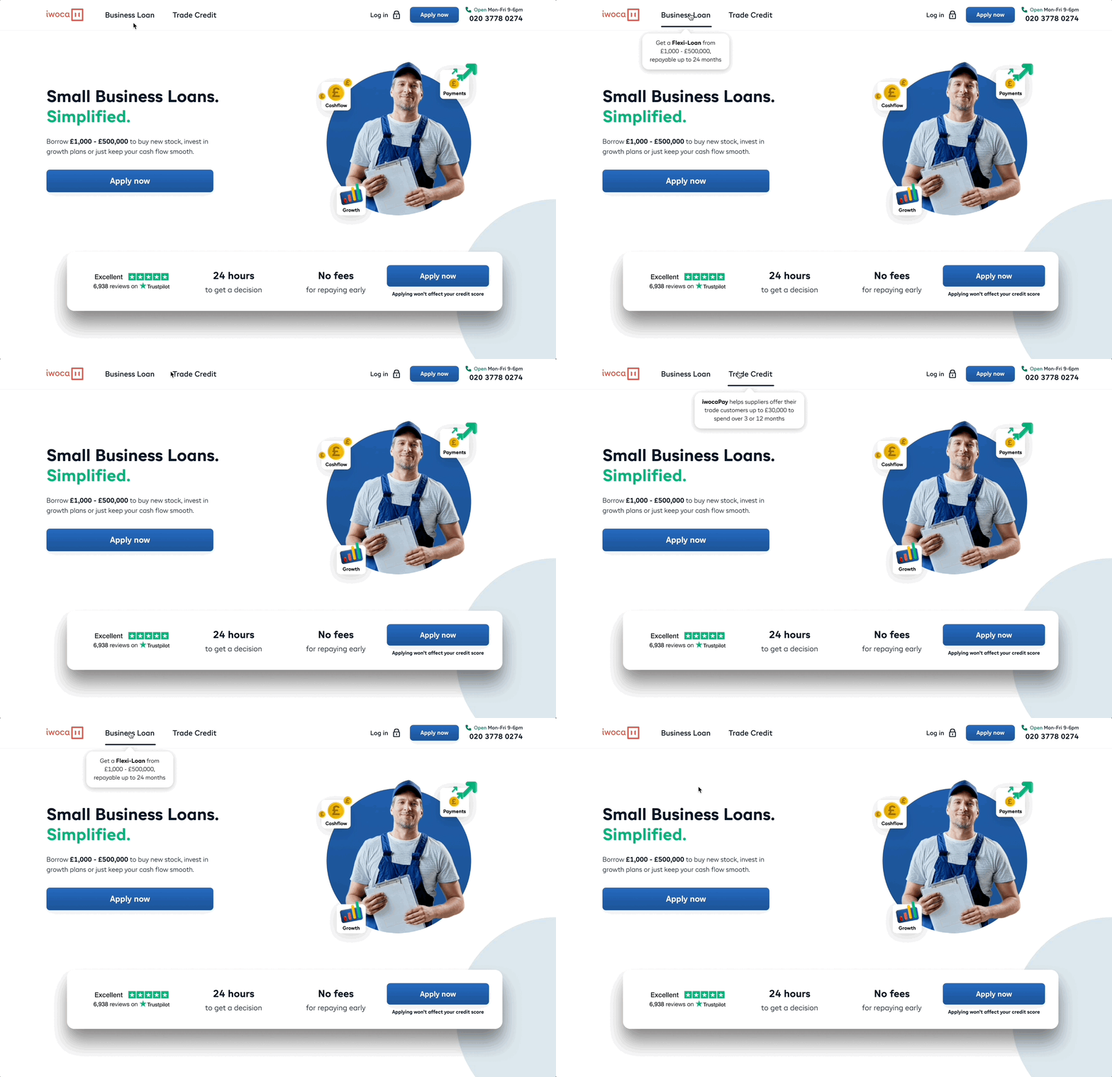
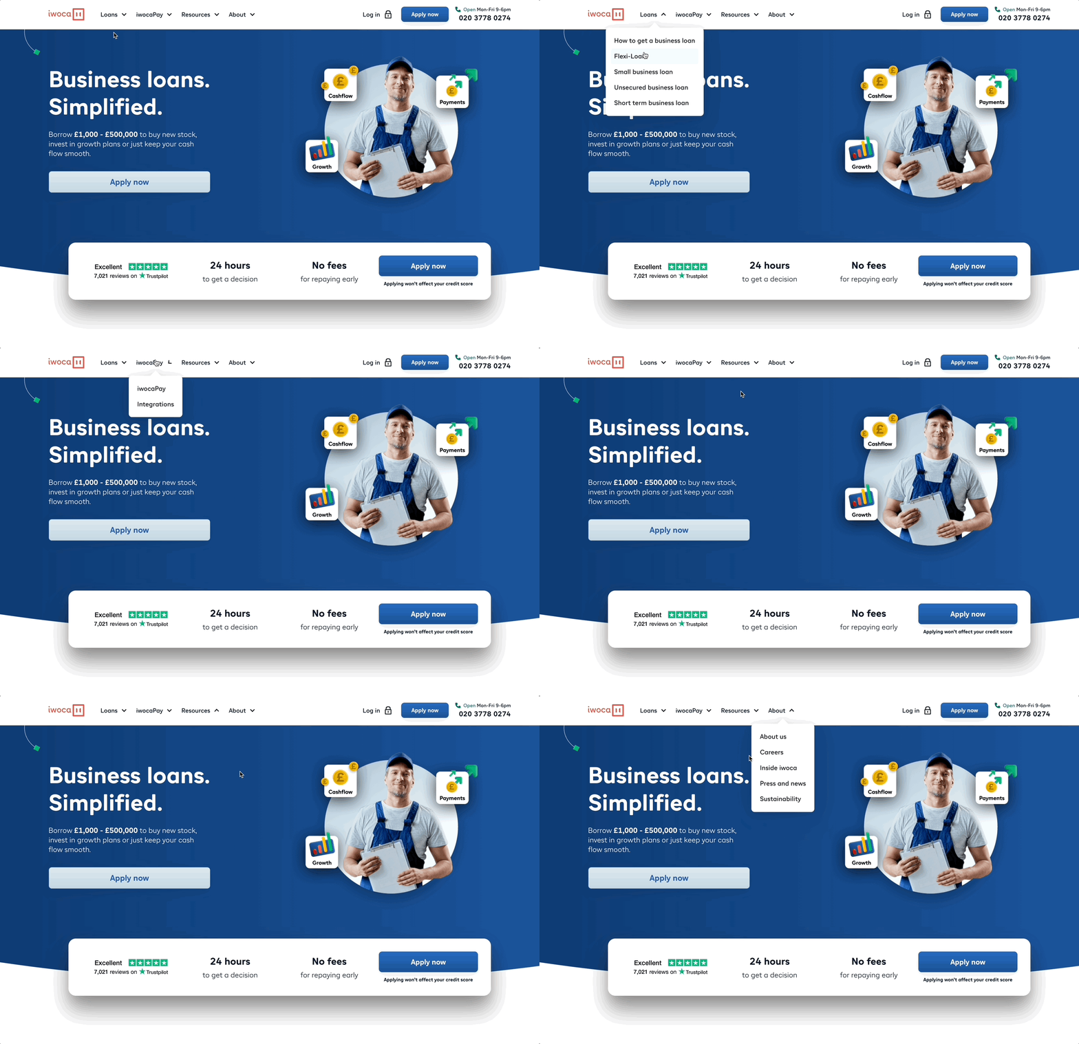
Check out a new optimised concept for the top menu navigation bar of our Desktop Website for iwoca LTD.
Summary of the Design Updates for Top Navigation Bar Redesign (IA):
Mobile & Desktop: Updated the terminology of our products site wide
Desktop: Added supportive explainer copy upon mouse hover for USP of our core products
Desktop: (Top Menu Navbar options) Removed 16 Navbar options. Kept 2: Business Loan and Trade Credit
Mobile: (Hamburger Menu options) Removed 16 options and kept 4
Mobile: (added a fixed sticky Apply button to Step Zero (increase conversion)
Mobile: New tracking on New Sticky Apply on GA4 + Full Story
Mobile: (added Trustpilot reviews, google my business rating, telephone number, email and chat support
Desktop: Navigation bar target size increased on names
Mobile: Hamburger target size increased on names
Desktop: Created Black Underline when you hover w. mouse on Business Loan or Trade Credit


