La Zafra
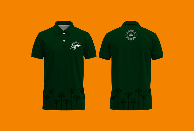
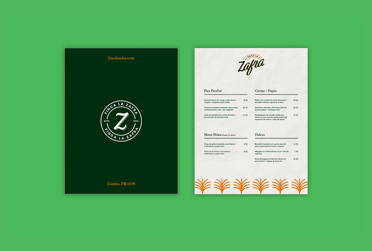
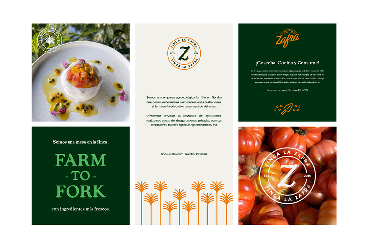
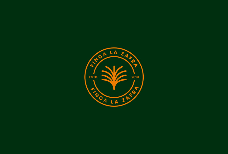
Here's the rebranding we made for Finca La Zafra. We modified a script font and applied a raised effect to it in order to create a dynamic harmony, and at the same time, a professional and fine appearance. We emphasized the name 'Zafra' which means "harvest time". For the design elements, we illustrated iconographies based on the four most important pillars of the industry: agriculture, gastronomy, tourism and education. Also, we designed a pattern where we apply icons and other concepts that are associated with the experience and services offered by the brand. The colors chosen are similar to those of the current brand, but with brighter tones to generate a color palette that transmits energy, attraction and profession.