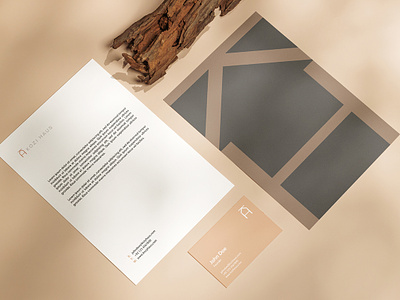
Kozi Haus
Kozi Haus offers a variety of home decor products that are meant to portray coziness in your home. Kozi Haus selects products that embody the following traits; earth tones, clean, simple, and minimalistic. Kozi Haus is made for every type of home.
Research & Planning
Since Kozi Haus was a new business, its branding had to be developed from ground zero. I had complete freedom in choosing the direction of their brand and devising the guidelines.
In consideration of their product line, which is focused on items such as unique vases, candleholders, and decorative trays, I decided to show some homely elements in the logomark. By playing with the letters K and H of Kozi Haus, I incorporated K as the roof and H as the foundation. The negative space between them created the impression of the inside of a house, resulting in a home-styled logomark.
Color Palette
To exude a cozy and calming feel, one that makes individuals feel at home and relaxed, I went with the earthy tones such as Canyon Clay, Graphite and Concrete.
Color Palette
As far as the typography is concerned, I went with Sofia Pro, since it comes with five weights and matches the homely vision of the business.
Logo animation by Eliyas Mohamed
Full case study coming real soon. ✌️
___
Interested in working together?
Feel free to e-mail me at
Behance | Instagram | LinkedIn
© 2024 Effendy Design. All Rights Reserved


