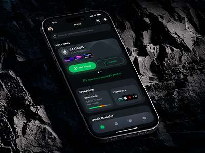
Finance Management Mobile App
Light or dark mode - what’s your choice? Judging by recent studies, people like both and use them for various purposes. Here is a light mode for a mobile banking app we’ve designed recently. Its target audience is rather wide with a different level of budgeting skills. So they need easy navigation, glanceable widgets, and a one-tap workflow. What’s more, when dealing with finances, timing is crucial, there is no place for setbacks. We placed the core features on the main screen and sorted them according to their importance, starting with quick access to personal accounts, statistics, and transfers.
Have a beautiful idea in mind? Let's collaborate!
design@shakuro.com
Shakuro
We are a web and mobile design and development agency. Making websites and apps, creating brand identities, and launching startups. Our goal is to help companies build relationships with their customers online through great design and technical performance.
Let's work together!
design@shakuro.com
Discover more about us at shakuro.com


