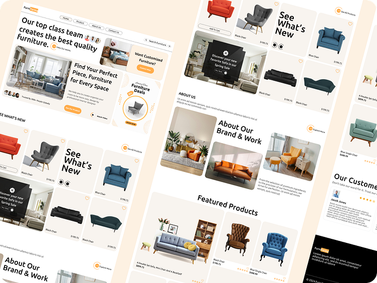
Furniture Website landing page
Hey, guys! Check out my Furniture Website landing page design.
Some features of this landing page:
Clear hero banner: The website uses a hero banner at the top of the page to showcase new products or deals. This can be an effective way to grab the user's attention and quickly convey the value proposition of the store.
Simple and clean layout: The website has a clean and uncluttered layout, which can make it easier for users to find what they are looking for.
Whitespace: The use of whitespace can help to improve the readability of the content and make the website feel less cluttered.
Large, high-quality product images: The website uses large, high-quality product images that allow users to get a good look at the furniture.
More Shots🤞
Full view
Press 💜 if you like my design and share feedback!
Contact Me
Work Inquiries 👉 ahadabdul.aa17@gmail.com


