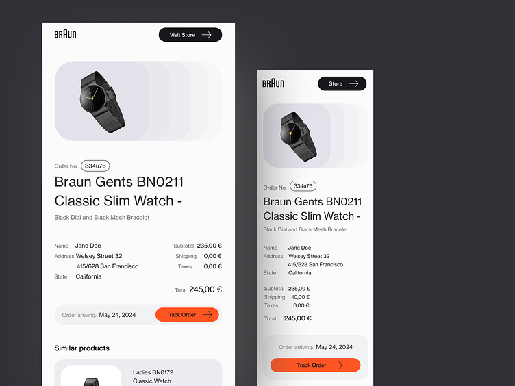
Braun Watches Email Redesign
Thinking behind the design
The current presentation of the Braun watches page and email fails to fully capture the essence of the brand. This led me to embark on a redesign journey, particularly focusing on enhancing the email experience by providing an overview of the ordered item.
In my design process, I always explore various directions to uncover the most fitting solution. This approach allows me to understand the potential and constraints of each direction as I navigate through the redesign process.
The final version of the redesign aimed to stay true to Braun's design philosophy, known for its simplicity, functionality, and minimalism. I ensured that the UI elements echoed the visual identity of Braun's physical products, utilizing fonts and colors that resonated with the brand. Here, the product takes center stage while the UI elements provide necessary information, maintaining a clean and aesthetic quality.
All images belong to the Braun.
Interested in working with me? Contact me at kratina.lejla@gmail.com

