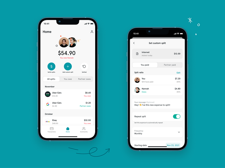
[Case study] Tandem — Sharing expenses for couples
A while back, during my tenure as the lead Product Designer at Z1, I had the opportunity to contribute to a very unique project. Tandem, a NY-based fintech startup owned by Daniel and Michelle, had an idea: create a consumer platform aimed at couples in the US to easily share and settle expenses.
The MVP was supported by the Z1 team, which included a Product Manager, a Product Designer (myself), Fran Pulido for illustrations, two frontend developers, and one backend developer.
We collaborated with Tandem through two-week design sprints, focusing on research, refinement, and the creation of new features. This project ran concurrently with others, with our dedicated time not exceeding 1/3 of our availability.
The challenge
The core idea of the MVP was interesting but it suffered from several issues that frustrated users and did not allow it to deliver the desired impact. The customer came to Z1 to improve the overall experience and lay the foundations for a successful app, but with a limited budget and time.
Our mission was to overhaul the user experience, introduce a coherent visual design, develop new features, establish a solid design system, and optimize the codebase.
The original designs made by the client.
The process
Our journey began with user research, using insights provided by the client to deeply understand the financial management challenges faced by young couples and flatmates. This step was crucial to empathize with our users and to design solutions that truly meet their needs.
Next, we identified and prioritized the main features and conducted a comprehensive design audit. This allowed us to pinpoint key areas for significant improvement in user experience and visual design. By examining every detail, we could ensure that our design solutions would effectively address these issues and enhance the overall user experience.
To further refine our approach, we undertook desk research, benchmarking Tandem against similar applications to gain valuable insights. This step broadened our understanding of the competitive landscape and provided us with a solid foundation to design innovative solutions for Tandem.
We continued with reorganizing the Information Architecture to align with the client's MVP and feature list, leading to minor adjustments that clarified the project's scope. Subsequently, we developed user flows for key functionalities, refining their requirements to ensure clarity, logic, and fluidity in user actions. This foundational work set the stage for a more intuitive and streamlined user experience, facilitating a smoother navigation path through the app's diverse features.
Once the user flows were finished, we proceeded to the wireframing stage. During this process, we explored different alternatives for various flows and screens. Through low-fidelity screen designs and guerrilla testing, we identified effective enhancements, notably the split ratio component.
The Home page had issues with inconsistent terminology, unclear tab labels, uniform button hierarchy, and an unintuitive 'Add expense' icon. Improvements included adding a partner's avatar, enhancing copy clarity, introducing color coding for 'You owe' or 'Partner owe,' improving button hierarchy, and adding payer and total amount information with month labels.
In the Split expense section, users faced issues with unclear navigation and missing payment information. Improvements included dividing the flow into transaction detail and split expense screens, adding categories and bank accounts, reorganizing elements, enhancing the split ratio component, and increasing consistency with standard components.
For the Add expense feature, the design lacked consistency with the 'Split transaction' feature, had confusing labels, and uncommon repeat interaction. The new design allowed users to name the expense, select a category, add a message, select the payer with a segmented control, and activate/deactivate the repeat feature, improving overall consistency and clarity.
The outcome
A multitude of steps were taken to bring the reimagined Tandem to life.
Firstly, we worked on crafting a unique visual identity for Tandem. The challenge was to balance the casual, fun aspects of couplehood with the seriousness of financial transactions. This was achieved by conducting a detailed questionnaire and interviews with the client about their values and target audience to define a unique positioning. The result was a fun and casual brand that maintained the necessary precision and clarity for a platform centered around money transactions.
Next, the visual identity was extended into a comprehensive design system. The design system was developed with the purpose of propagating the new visual style throughout the app, bringing consistency and coherence to the user interface. This significantly improved the app's usability. The design system was then applied to the wireflows that had been created.
Subsequent to the development of the design system, a proper handoff process was initiated to bridge the gap between design and development. Despite tight deadlines, we maintained a consistent and systematic approach to handoff which made life easier for the developers. Key pillars of the handoff included thorough documentation, correct use of naming conventions, components, autolayout and variants, the implementation of native elements, and standardized styles.
Finally, once the new design was ready, prototypes of the main flows and interactions were created. These prototypes brought the designs to life and allowed for tangible interaction with the platform before the development phase.
Reflection
Steering Tandem's transformation was an exhilarating endeavor that expanded my horizons as a Lead Designer. This project was more than developing an app; it was about crafting a platform that empowers couples to seamlessly manage their finances, fostering closer bonds and financial clarity.
I hope the insights from Tandem's journey ignite the same passion and curiosity in you. If this story resonates with you, show some love with a 'L' and let's keep in touch!
Follow my journey here and connect on LinkedIn for more stories of design.


