Job Search Platform
Hi creative folks 👋
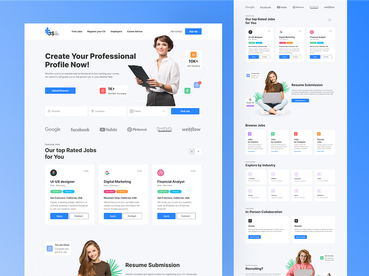
I suggest reviewing a shot of the job search platform. I've highlighted the main points that reflect the UI-UX design.
Homepage:
Engaging interface showcasing featured job listings.
Clear navigation to explore job categories and search options.
Introduction to the platform's unique features and benefits.
Search:
Dynamic search bar allowing users to find jobs by keywords, location, or company name.
Categories:
Well-organized job categories enabling users to browse positions by industry.
Visual representation of categories for easy navigation and exploration.
Offer for Job Seekers:
Personalized job recommendations based on the user's profile, skills, and preferences.
Insights into trending job opportunities and companies actively hiring within the user's field.
Offer for Recruiters:
Streamlined tools for recruiters to post job openings, manage applications, and track candidate progress.
Analytics dashboard providing valuable insights into job posting performance and applicant demographics.
Work Format Selection - Remote or On-Site:
Flexible options allowing users to filter job listings based on their preferred work format - remote or office-based.
Interactive map feature highlighting job opportunities in specific geographic regions.
Guidance and Tips:
Interactive tutorials and FAQs to assist users in navigating the platform effectively and maximizing their job search success.
I am open to your suggestions 🤠 please send your request to my email at ✉️kateryna.burych@gmail.com, or contact me via ☑️ Linkedin
