Industry 4.0 - Brand Identity - Vitesse Automation
The merger between Niagara and Full Speed Automation (FSA) gave birth to a new entity → Vitesse Automation. We took the time to rethink the visual identity to reflect this evolution.
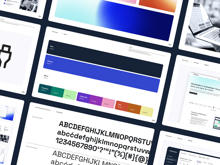
We opted for sober and professional colors, combining those of FSA and Niagara.
To stand out, we chose two key elements: texture, a nod to the materiality specific to FSA, which also manufactures hardware, as well as gradients, Niagara's signature.
Regarding the typography, our choice fell on Space Grotesk, an assertive font, far from the old Ubuntu and Source Sans Pro. It conveys an impression of technology without falling into overly “geek” jargon.
Visible at : www.vitesseautomation.com
More by Anna View profile
Like


