Vineyard/Winery Branding
Challenge: A local vineyard and winery sought a friendly and approachable brand identity encompassing a logo, branding elements, and packaging design. Their unique selling points included a distinctive red barn and a resident heron that they wanted to incorporate into the brand.
Solution: I designed a cohesive brand strategy that reflected their warm and welcoming atmosphere. This included:
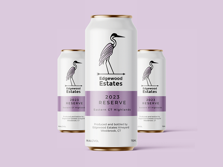
Charming Logo: A modern typeface was paired with a playful illustration of a heron perched on a weather vane, subtly referencing their iconic barn.
Colorful Branding: Each wine varietal received a unique color scheme that reflected its personality and style, creating visual distinction and enhancing shelf presence.
Cohesive Packaging: Consistent design elements were applied across both can and bottle packaging, ensuring easy product identification and brand consistency.
Outcome: The new brand captured the winery’s friendly and approachable nature. The unique varietal colors and the charming logo successfully differentiated their products while creating a unified and memorable brand experience for consumers.

