Calendar
Below is the overview of calendar UI design pages:
Calendar Overview
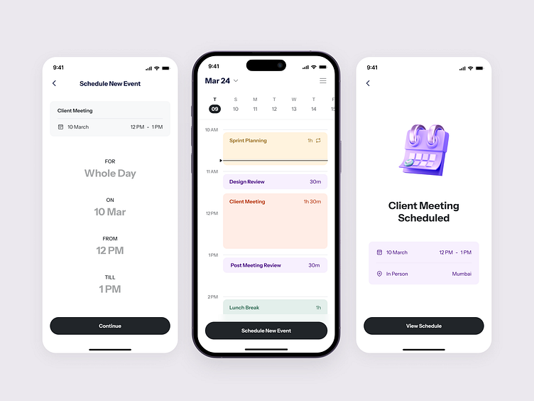
In the first mobile screen, you can see a quick overview of what's coming up on March 24th. Each event is shown as a colored bar, like "Sprint Planning" or "Client Meeting," so you can glance at your day and know what's happening.
Adding a New Event
If you want to add something new, just like in the second screen, you hit "Schedule New Event." Just type in the event name, and continue
Event Details
Then, in the third screen, you see all the details filled in for a new client meeting. It's clear and easy to fill out, like setting the time and location, which is super handy for staying organized.
Additional Options
Once you've got everything set up, like in the fourth screenshot, you can add any extra info you need, like an email address, and even pick a color for the event – in this case, it's purple!
Confirmation and Overview
And finally, in the fifth screenshot, you get that satisfying confirmation that everything's all set. It's nice to have that reassurance and see your whole schedule at a glance. It's like a little pat on the back for staying on top of things.
Liked our work and want to work with us?
Email us at 📩 hi@dvinu.com or 📞schedule a call
---
Follow us on Dribbble • Twitter • LinkedIn
Visit our website 👉🏾[dvinu.com]


