Natasha & Jacob Wagner's Wedding
I got married last October and took the opportunity to design the invitations and gifts. It was a great opportunity to check out different local print shops in town and practice my lettering skills.
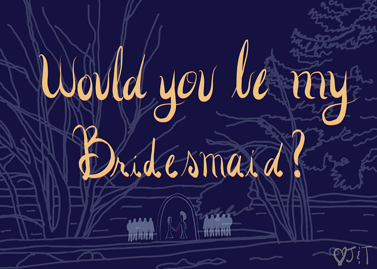
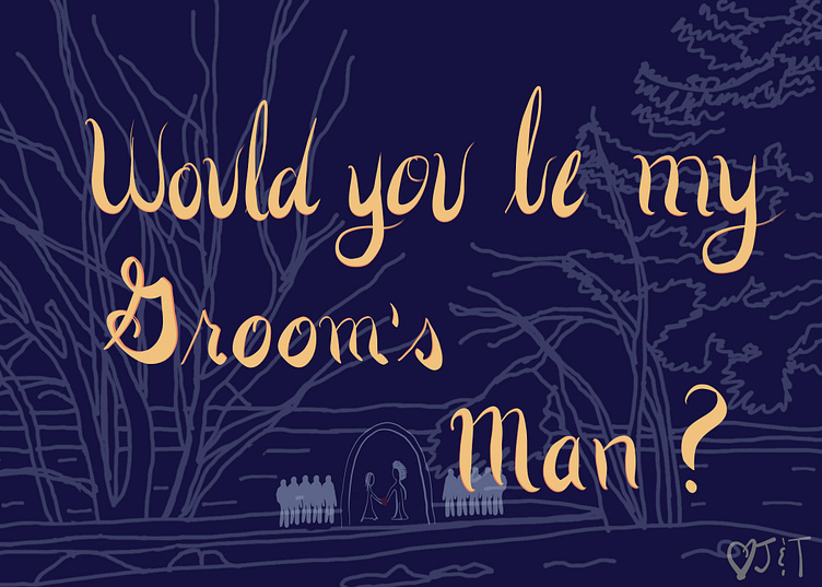
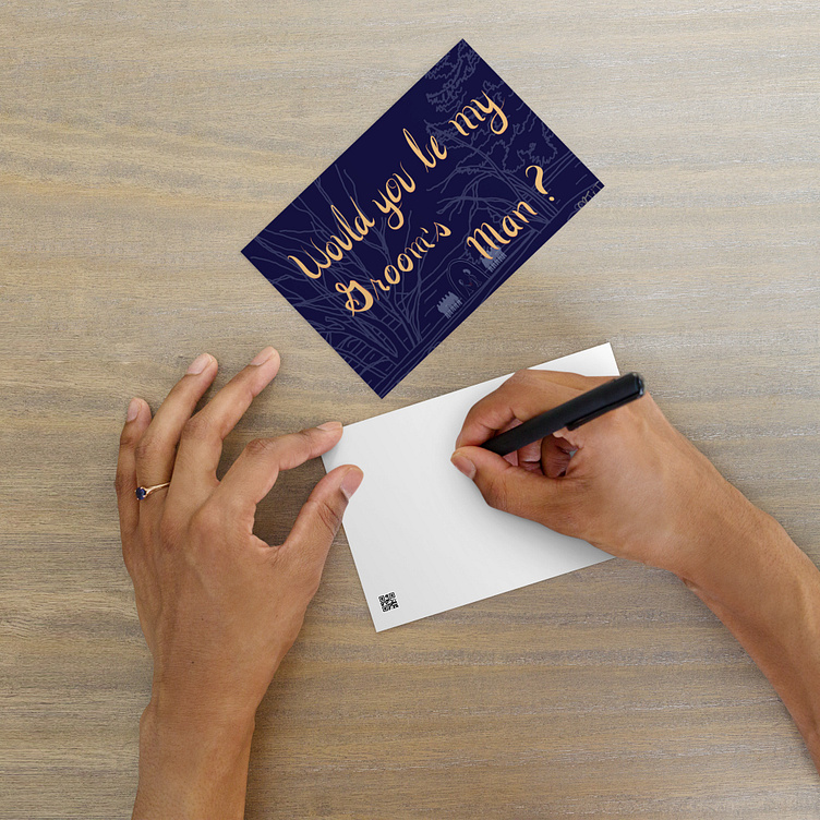
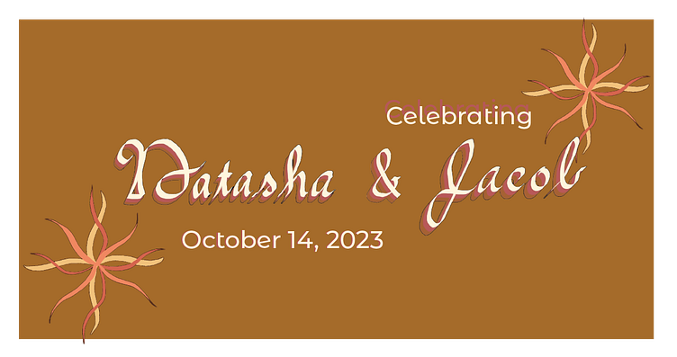
Wedding Party Invitations

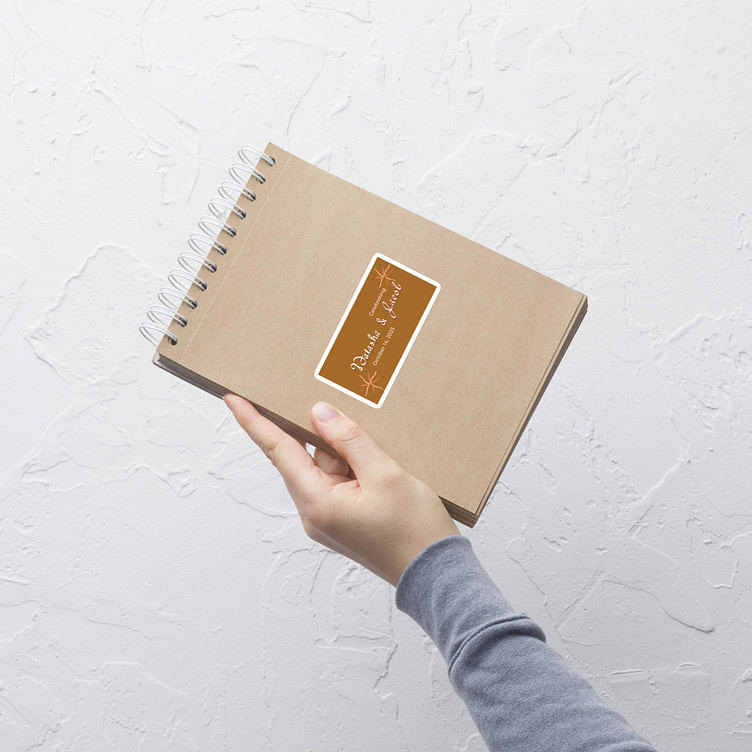
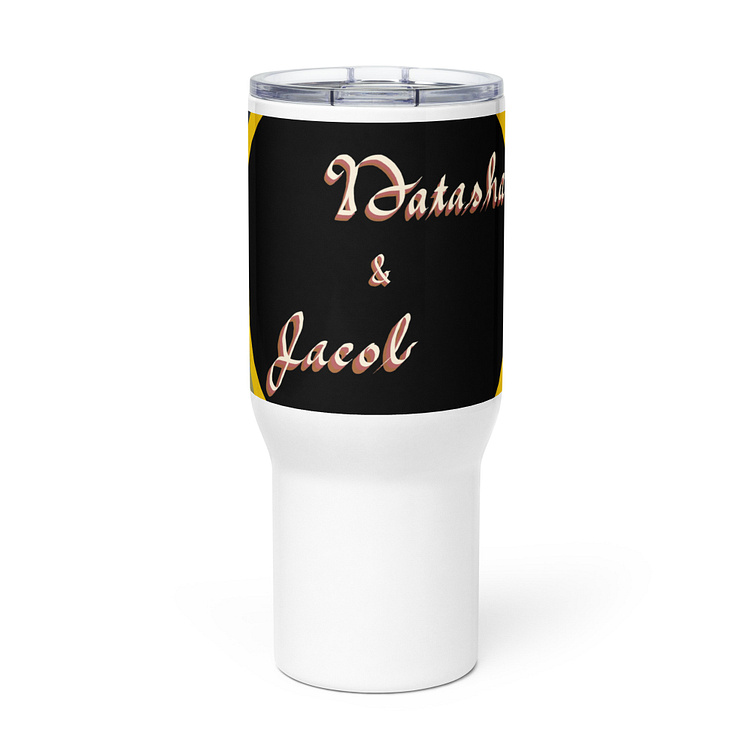
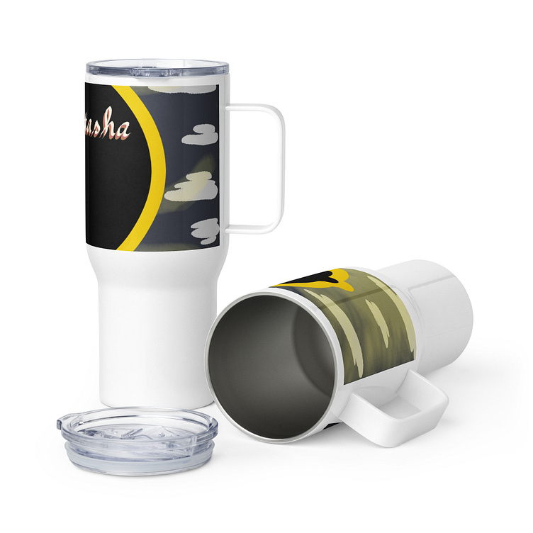
Stickers and Travel Mugs
Who doesn't love some good wedding swag?
Thank You Card
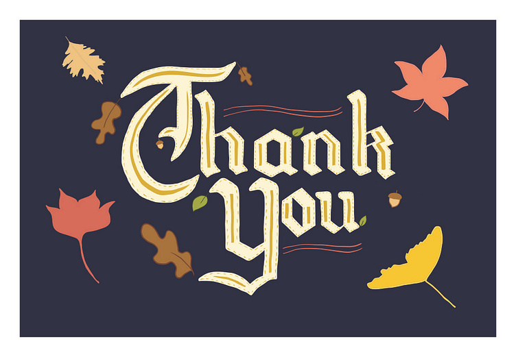
Notice that the style is a little different in the thank you card? I've been improving my skills with Martina Flor's Lettering Seminar course and it's showing. It's so important to have a place for peer review before presenting to the world. I don't need to be one of those designers with spelling errors and silly mistakes in their work.
What do you think of this typeface change from script to black lettering? Do you like my script or black lettering better?
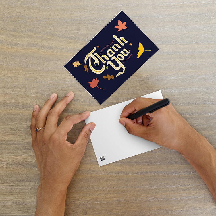
This thank you postcard is available for purchase.
Conclusion
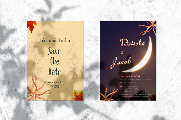
The design of this invitation suite is classic and elegant with a modern touch, aimed at conveying a formal and sophisticated ambiance for the event. The contrast, use of fonts, and botanical graphics are all well chosen to fit the fall eclipse wedding occasion. The presentation effectively showcases both the design detail and its application in a real-world setting.
