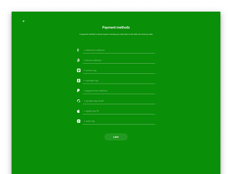
Sprocket Web Full-screen Payment Method Entry
We designed this to focus people to enter as many payment methods as possible ( to increase their chances of selling a bicycle through our platform ) and save real-estate on our creation screen. However it turned out to be not the way to go as we figured out we could simply make all of these in-line side-scrolling buttons in the creation screen instead :)
If you like it, don't hesitate to click "L" 💗 or "F" + "Follow"
👇 Follow us and get the app now + review us 🌟
Sprocket Bicycle App on Android
Sprocket Bicycle Blog on Instagram
Sprocket Bicycle Blog on Threads
Sprocket Bicycle Blog on YouTube
Sprocket Bicycle Blog on Tumblr
Sprocket Bicycle Blog on Facebook
Sprocket Bicycle Blog on Product Hunt
Sprocket Bicycle Blog on Blue Sky
Hi-Fi mocks/specs used in the design of the project as well as for the implementation which didnt happen for this one


