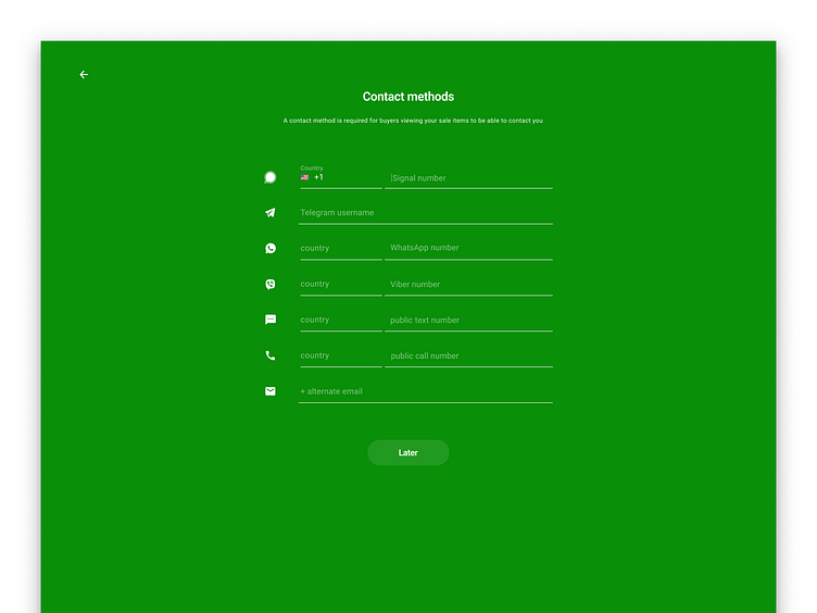
Sprocket Web Full-screen Contact Method Entry
A design we created to help people focus on filling out as many contact methods as possible and in order to shrink the real-estate for this in the listing creation screen ( or possibly even do this in onboarding instead ) However we decided this was not the right way to go and abandoned it in favor of the in-line side-scrolling row of contact buttons instead
If you like it, don't hesitate to click "L" 💗 or "F" + "Follow"
👇 Follow us and get the app now + review us 🌟
Sprocket Bicycle App on Android
Sprocket Bicycle Blog on Instagram
Sprocket Bicycle Blog on Threads
Sprocket Bicycle Blog on YouTube
Sprocket Bicycle Blog on Tumblr
Sprocket Bicycle Blog on Facebook
Sprocket Bicycle Blog on Product Hunt
Sprocket Bicycle Blog on Blue Sky
Hi-Fi mocks/specs used in the design and for possible implementation of these changes


