Android Permissions
Inspired by a real-world project due to the Android 12 permissions update.
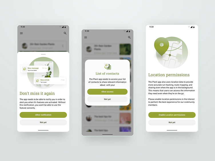
Comparing three different components and design patterns. From the left to the right: Bottom Sheet - Dialog - Screen.
This project was created to explore how the new Android 12 permissions update affects user experience and to determine which design pattern would be the most efficient in terms of UX. By comparing three components, it allowed the team to see which one was the best option in terms of both UX and permissions.
Unless for consistency I would recommend using only one for your app.
I made use of material 3 components and Google library for the icons. Illustrations have been made by me.
👋 Hey hey, if this design caught your eye, give it a ❤️! Your like fuels my creativity.
