Spendy
The story behind this shot
This shot is the result of participating in the second season of "Detepr Workout."
The Task: Come up with and draw the screen of a simple application that analyzes spending over the past day, week, or month and makes recommendations about financial literacy. The interface should be modern and clear at a glance.
Target Audience: People with average incomes who want to start taking money more responsibly, but don't know how to do it. They should want to open this app every day.
In the Detepr challenge, the focus is typically on creating a good UI, and deep product development is not always required. However, this task involved working on user engagement, which I found interesting. So, I decided to take a deeper look into the app's concept.
Finding a solution
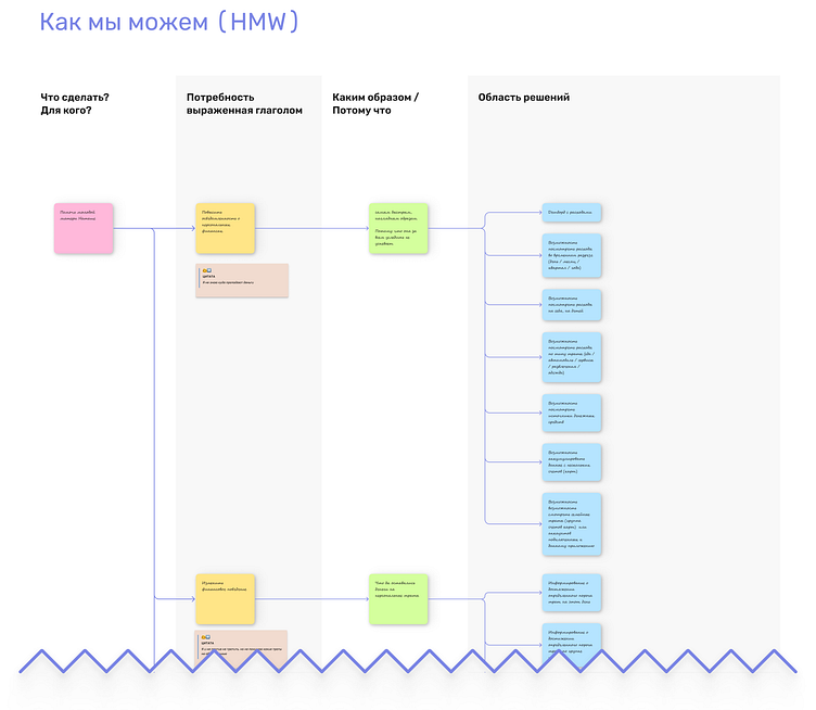
The initial data consisted only of a textual description of the idea. To start, I decided to create a basic information structure for the app screen. To organize my thoughts and move forward more quickly, I used the "How Might We" (HMW) methodology. This approach helped me transition from identifying the target audience's needs to describing possible solutions, including their qualitative characteristics, and then to specific interface solutions. I documented all of this on an online whiteboard.
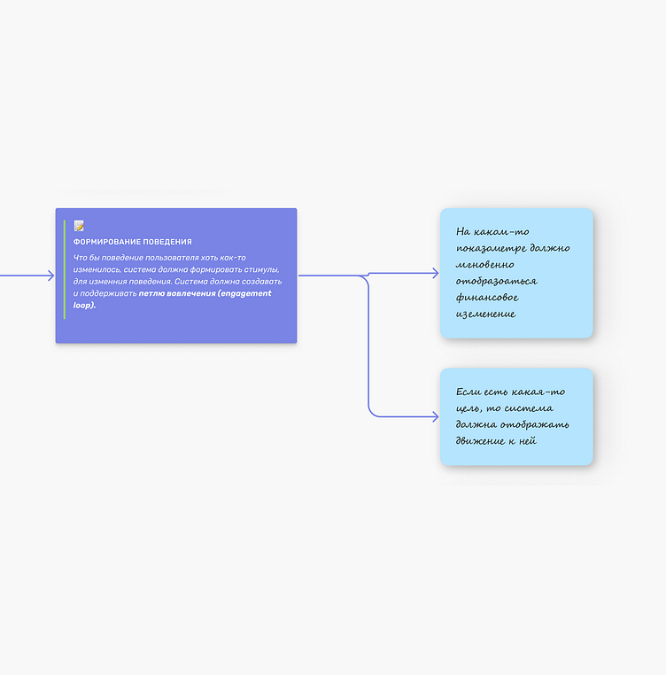
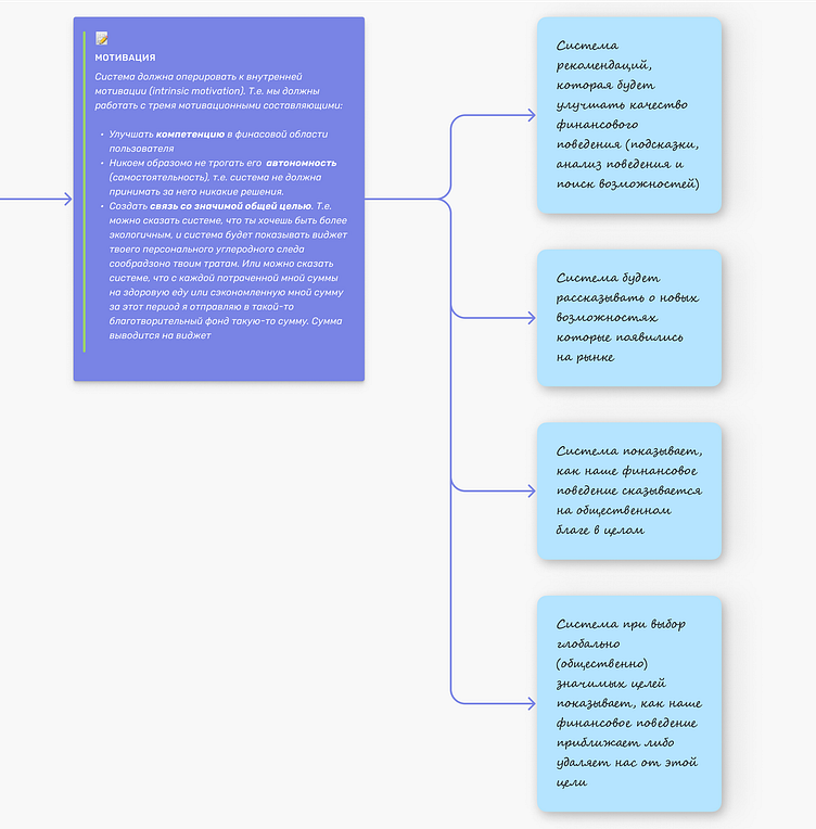
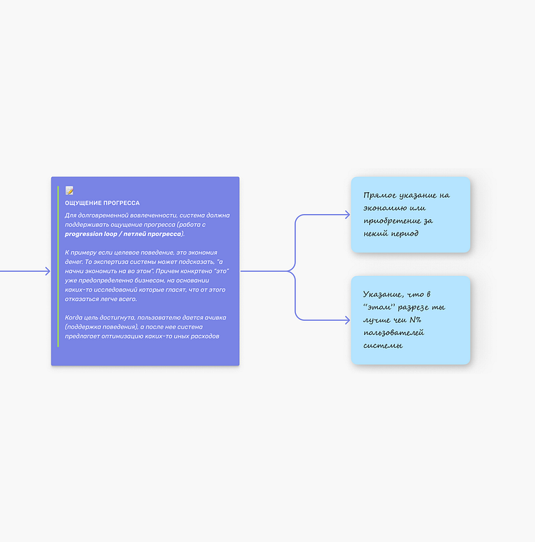
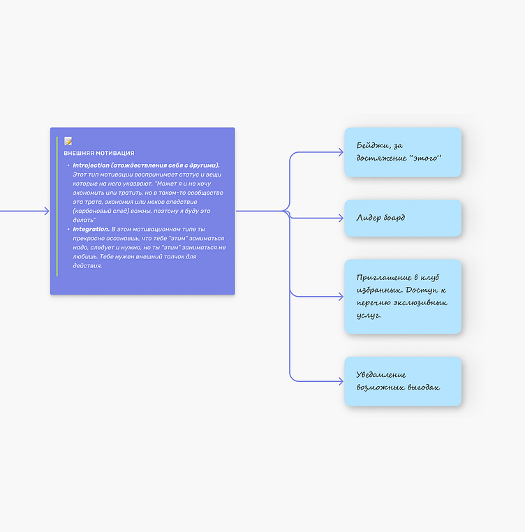
Next, I identified solutions that would impact engagement, help users develop habits, motivate them, and create a sense of progress. I considered solutions that encourage repeat use (fostering internal motivation and triggers for external motivation).
Then, for each solution on blue stickers, I quickly sketched out the interface concepts in my notebook.
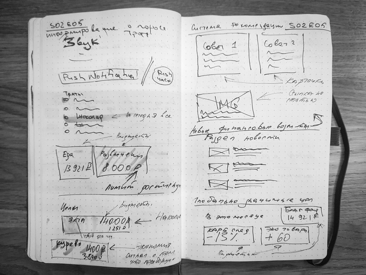
After that, I created wireframes for the screen layouts, adding elements that would boost engagement and form usage habits.
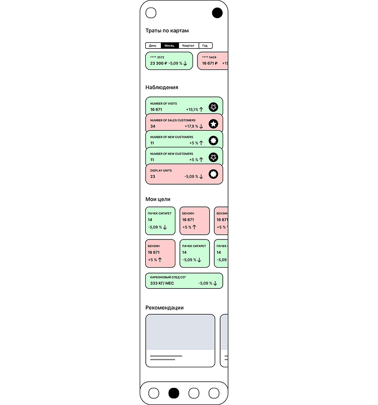
Then, I created different layout variations, combining the "core elements" (key scenarios for the task) with elements that influence user engagement.
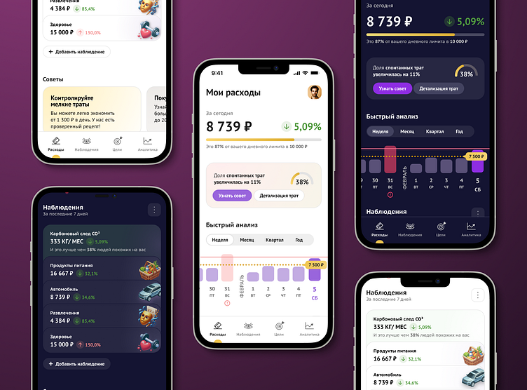
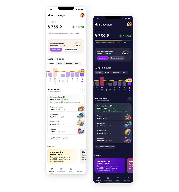
After several iterations, I found a suitable graphic solution that could be refined further. The final version is presented at the beginning of this case.
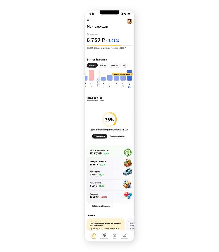
So, we have a concept that should help to form habits and increase user engagement. In addition, light and dark color schemes were designed.
