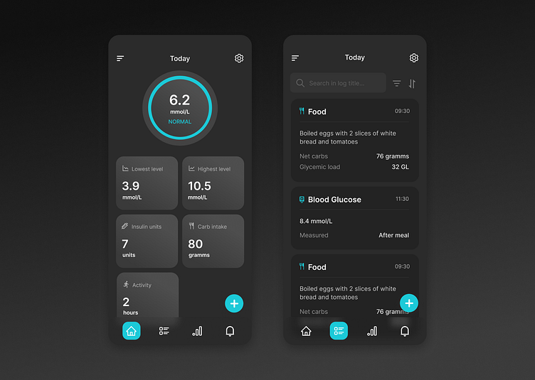
Healthcare mobile application for diabetics dark mode
The dark mode of this healthcare app was designed with user comfort in mind, especially for low-light environments. By utilizing a sleek, modern black and gray color scheme with vibrant blue accents, the app provides a focused and visually striking experience while reducing eye strain.
The dark mode maintains the same clear and organized layout as its light counterpart, ensuring consistent usability. Key health metrics stand out against the darker background, offering users a visually engaging way to track their data without compromising on functionality or readability.
More by Sara Sz View profile
Like
