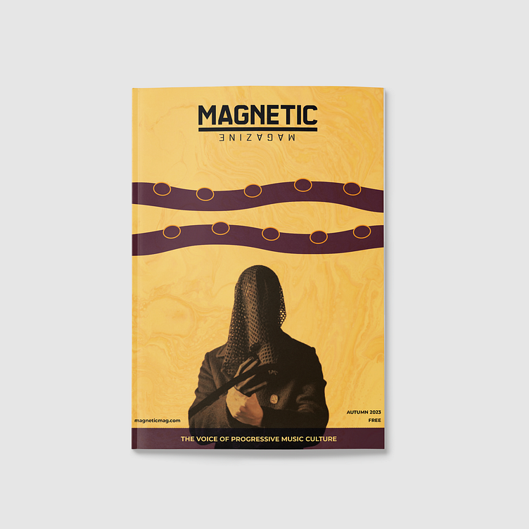
Magazine cover & layout
Brief
This is a school assignment
Develop a concept for the printed publication of Magnetic Magazine. Magnetic Magazine is an online publication focusing on electronic music news, reviews, interviews, and industry insights.
With the magazine cover, they want to convey the creative nature of the brand and the fact that they support artistic progressive culture. In addition to the cover, they want an index page and design and layout of four articles. The articles must be chosen from different categories on their website.
Cover
The custom-designed cover showcases an exclusive interview with the artist Modapit, where he shares insights into his creative process, describing how waves of inspiration influence his songwriting. Reflecting this statement, the design incorporates dynamic elements reflecting these bursts of inspiration. Vibrant colors evoke a sense of hope, reflecting the artist's intention to convey optimism through his latest music release. The overall aesthetic is crafted to underscore Modapit's unique artistic style and creative vision."
Magazine
The magazine is sized at 203x276mm, allowing for a margin space that provides a bit of extra room at the bottom of the pages. Its grid structure consists of 5 columns and 5 rows, offering flexibility for layout experimentation across the magazine. Delicate, colored lines are subtly integrated throughout, serving as guiding elements and implying movement. Consistency is maintained in the text elements.
Magnetic Magazine emphasizes creativity and self-expression, aiming to infuse each article with unique features. Careful consideration has been given to incorporating enough breathing space within the articles to ensure readability. Additionally, relevant images are strategically placed to enhance visual interest and create dynamic compositions


